elinemcgeorge.net
A website to showcase the work of critically acclaimed artist, Eline McGeorge. Gathering an eclectic array of medium together into a science-fiction inspired database structure that encourages exploration.
Client
Eline McGeorge
Category
Website
Development
Matthew Luke Studio
Typeface
TWK Everett
McGeorge’s work is research driven, which she then utilises to create artwork that spans from utilising a variety of low-tech techniques, improvised craft, abstraction, digital media and text. Each piece is informed by socio-political and environmental questions, which in turn is further inspired by science fiction, feminist legacies, regenerative and self-organisation practices.
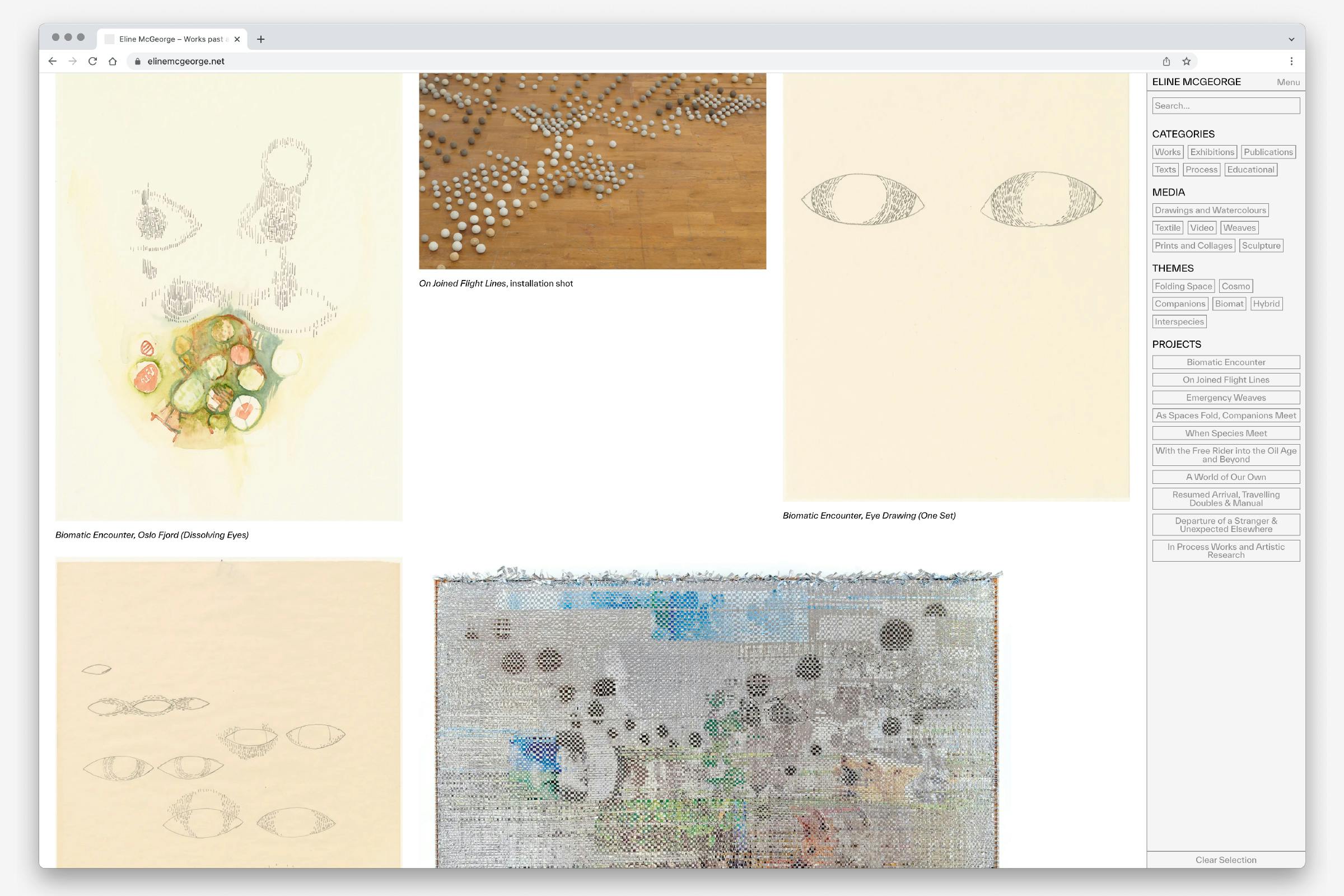
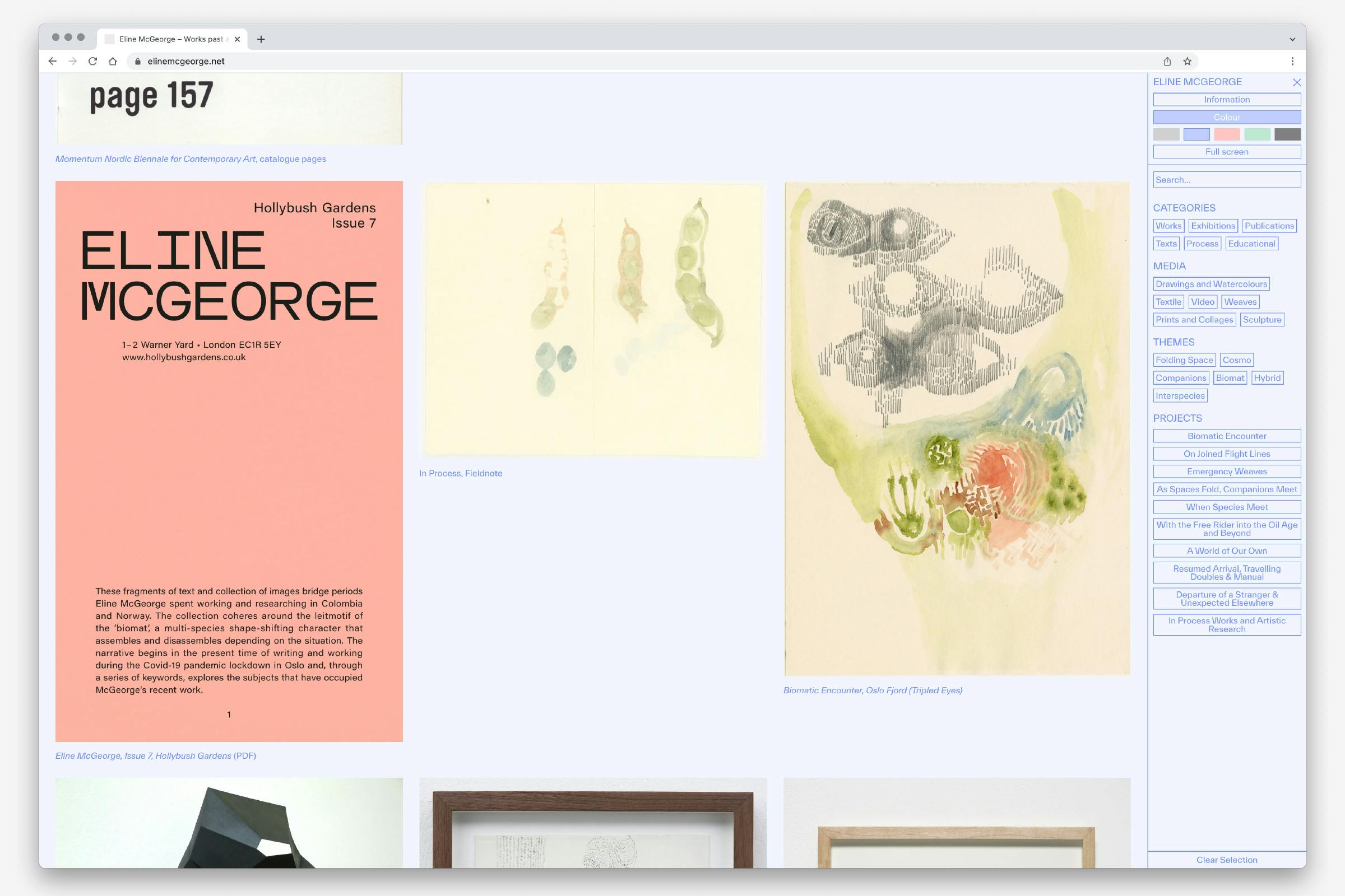
The website starts with a large-scale overview of every project. Navigated through a menu bar to the right-hand side of the screen. This menu bar divides projects into a series of tags: categories of project, the medium a project was created in, thematic links, and specific project narratives.
The page can be blown-up to be full-screen, or it can be customised by the user – giving a selection of several different coloured backgrounds.
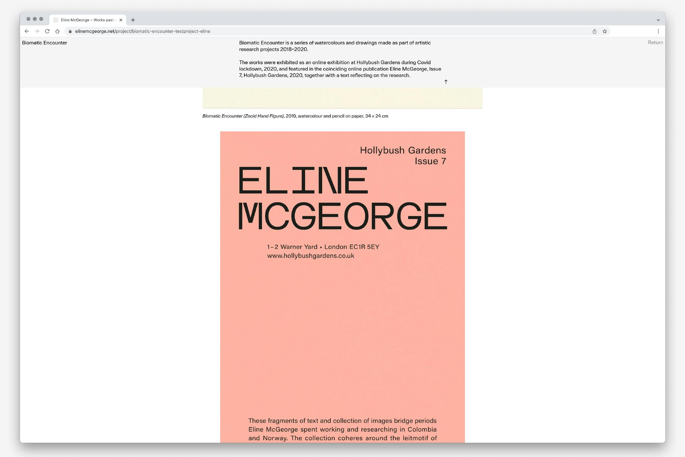
Selecting a work takes you to the specific project page, aligning the imagery as a single central column and presenting them as large as possible on the users screen Each image has the option of including an extended caption text.
Further information about the project can be accessed by expanding the drop-down description in the menu bar at the top of the page.
The information page further builds on the database aesthetic. Featuring the option of a perpetual scrolling news bar, and several columns of content, navigable through a series of button tabs.
This page also presents the work in a more linear fashion, listing specific projects, exhibitions, publications and texts in chronological or alphabetical order. Each entry is an active link that takes you to the relevant project page.
The website is set in the typeface Everett by Type Weltkern. A grotesque sans serif with strong typographic details that find a balance between tension and reading comfort. The joints of the letterforms taper into each other, giving a distinctive digital feeling – leaning into the science fiction inspirations often found in McGeorge’s work.

