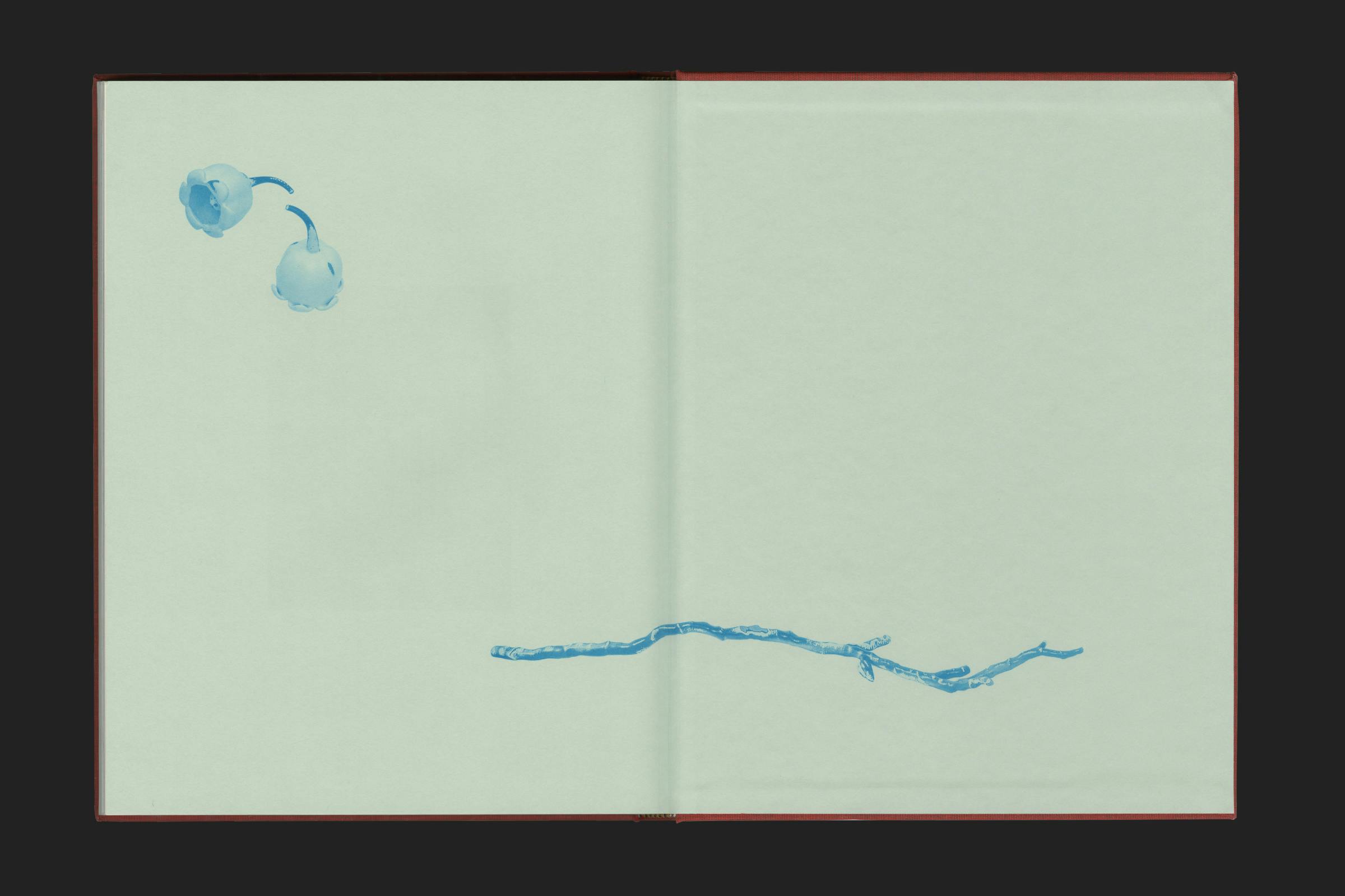
Magali Reus: Red Roses
1/14
A hardback publication showcasing five series of works by internationally acclaimed artist, Magali Reus. First exhibited in Museum Dhondt-Dhaenens in Belgium, centre d’art contemporain – la synagogue de Delme in France, and Kunshalle Bratislava in Slovakia.
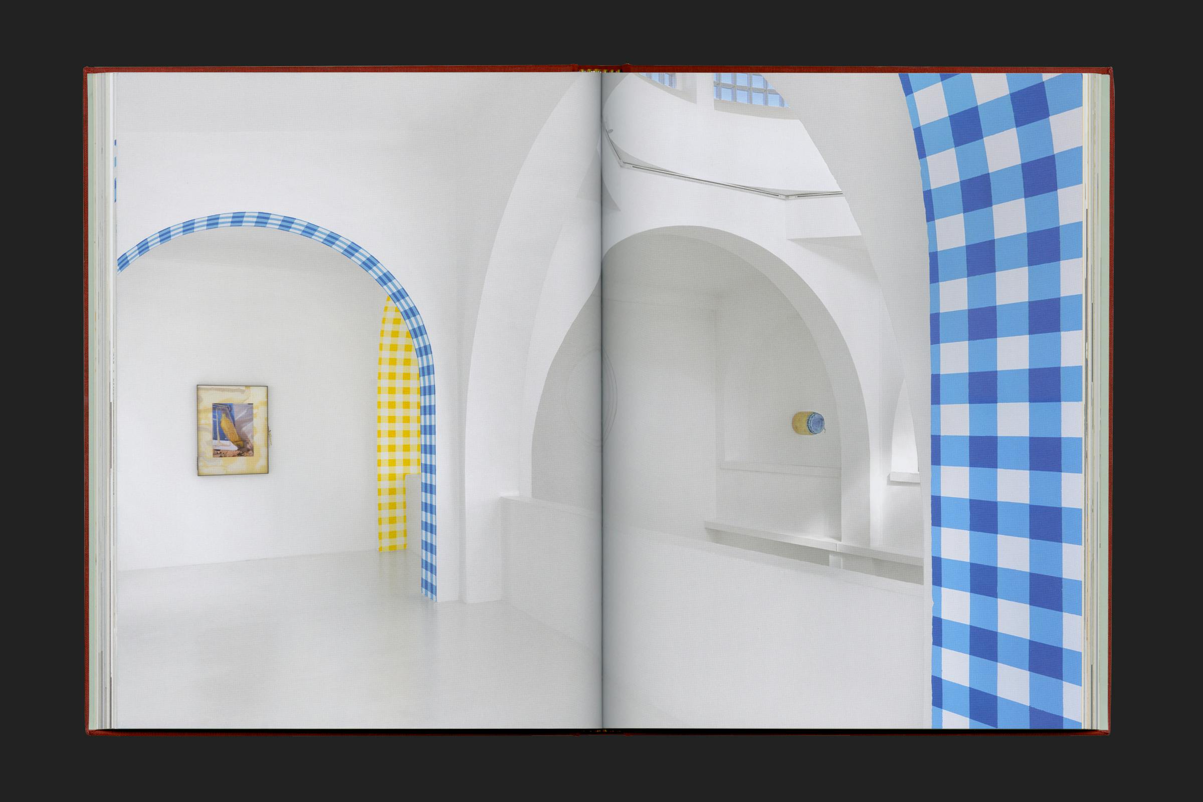
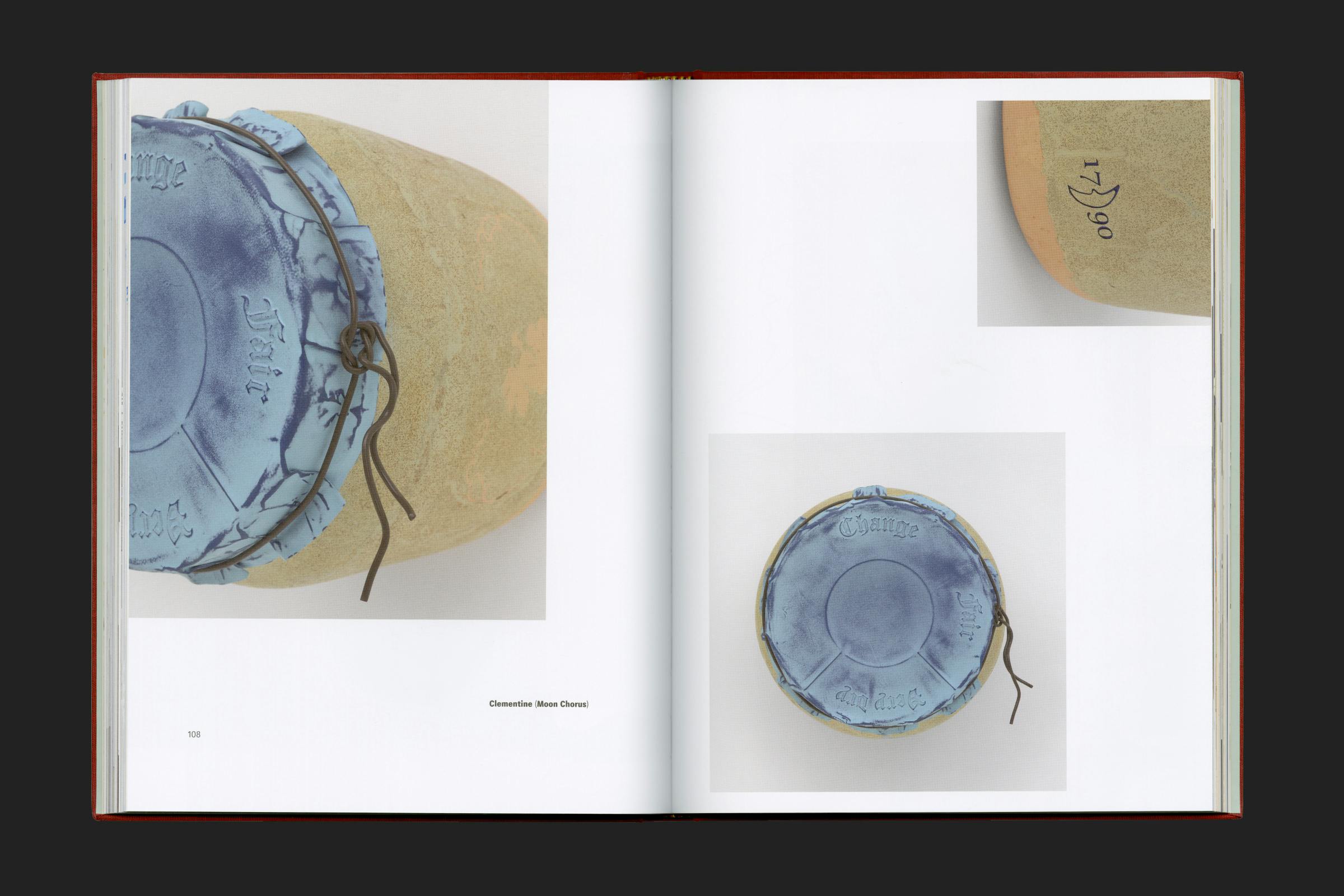
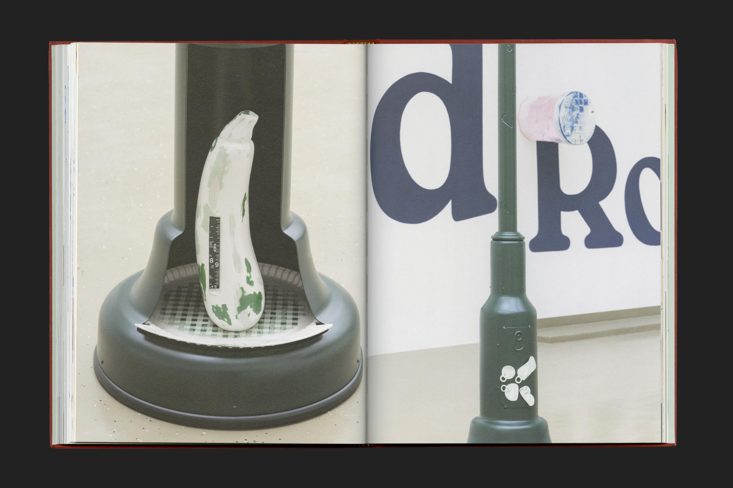
Through these sculptures, Reus investigates our relationship with objects, interrogating the production and consumption processes of our society. They appear functional, but do not explicitly reveal what their function actually is.
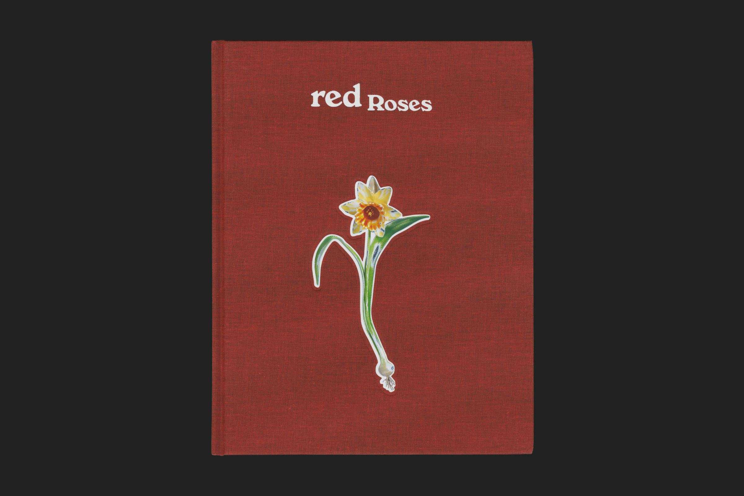
Working in close collaboration with the artist, the book forms a collection of elements through intricately interwoven pages, showcasing contextual research, process, manufacture, creative writing, documentary photography and installations. Framed within a storybook-like cover with a die-cut inlaid daffodil and foil text over cloth.
Client
nai010
Category
Editor
Laurence Ostyn
Texts
Rebecca May Johnson, Filipa Ramos
Format
225 × 290 mm
Extent
208pp
Cover
Hardback
Finishing
Foil, tipped on die-cut image
Binding
Section sewn
Typefaces
Herbik, Maxima, Windsor
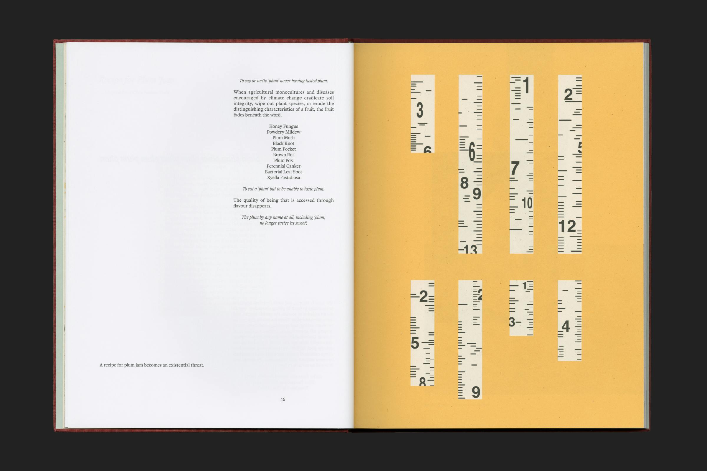
Sections of contextual imagery – research, work-in-progress and production experimentation – are graphically interpreted through black and orange Pantone interventions printed on a light-yellow, recycled, textured paper. These images have been edited to highlight selected elements and to draw out detail.
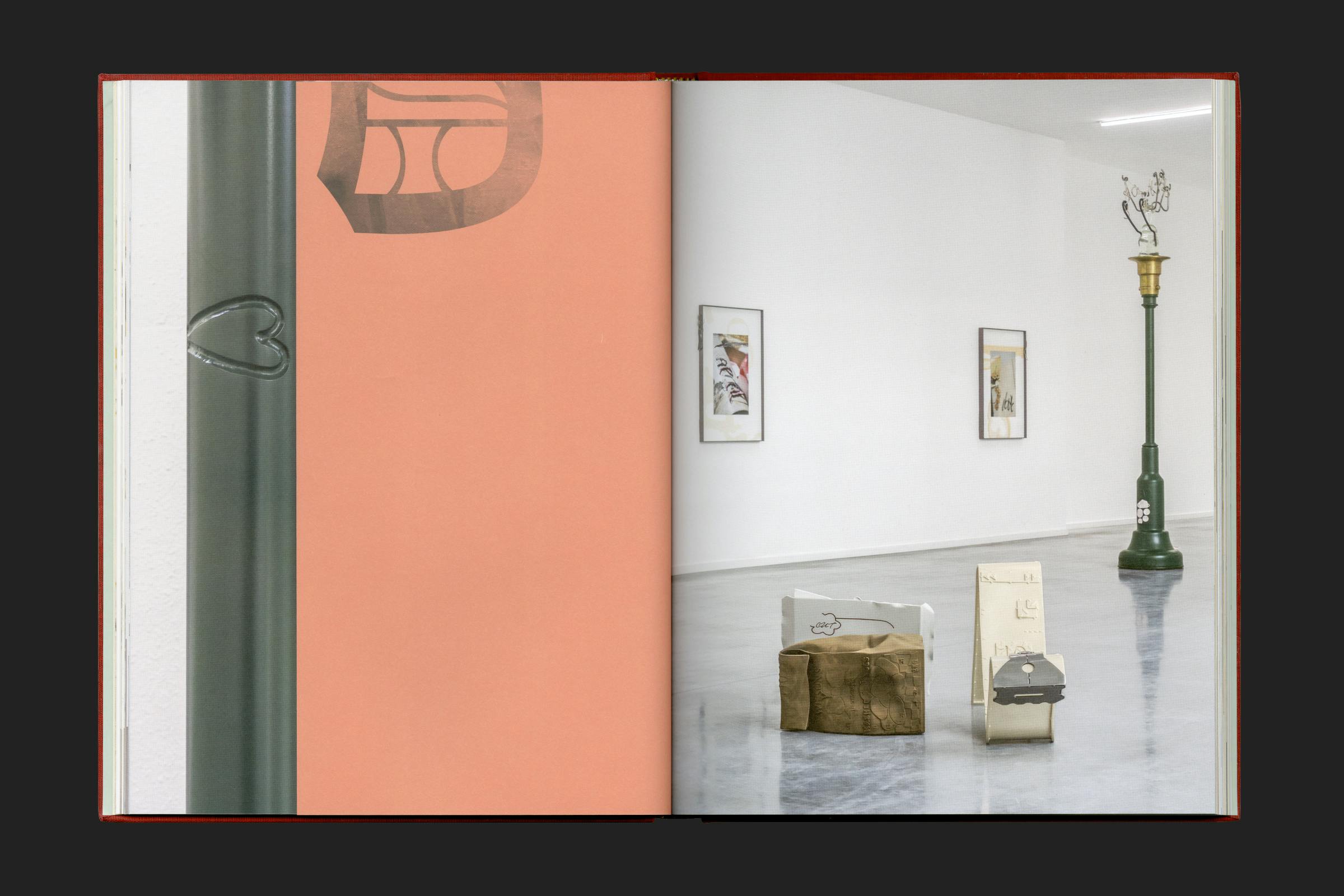
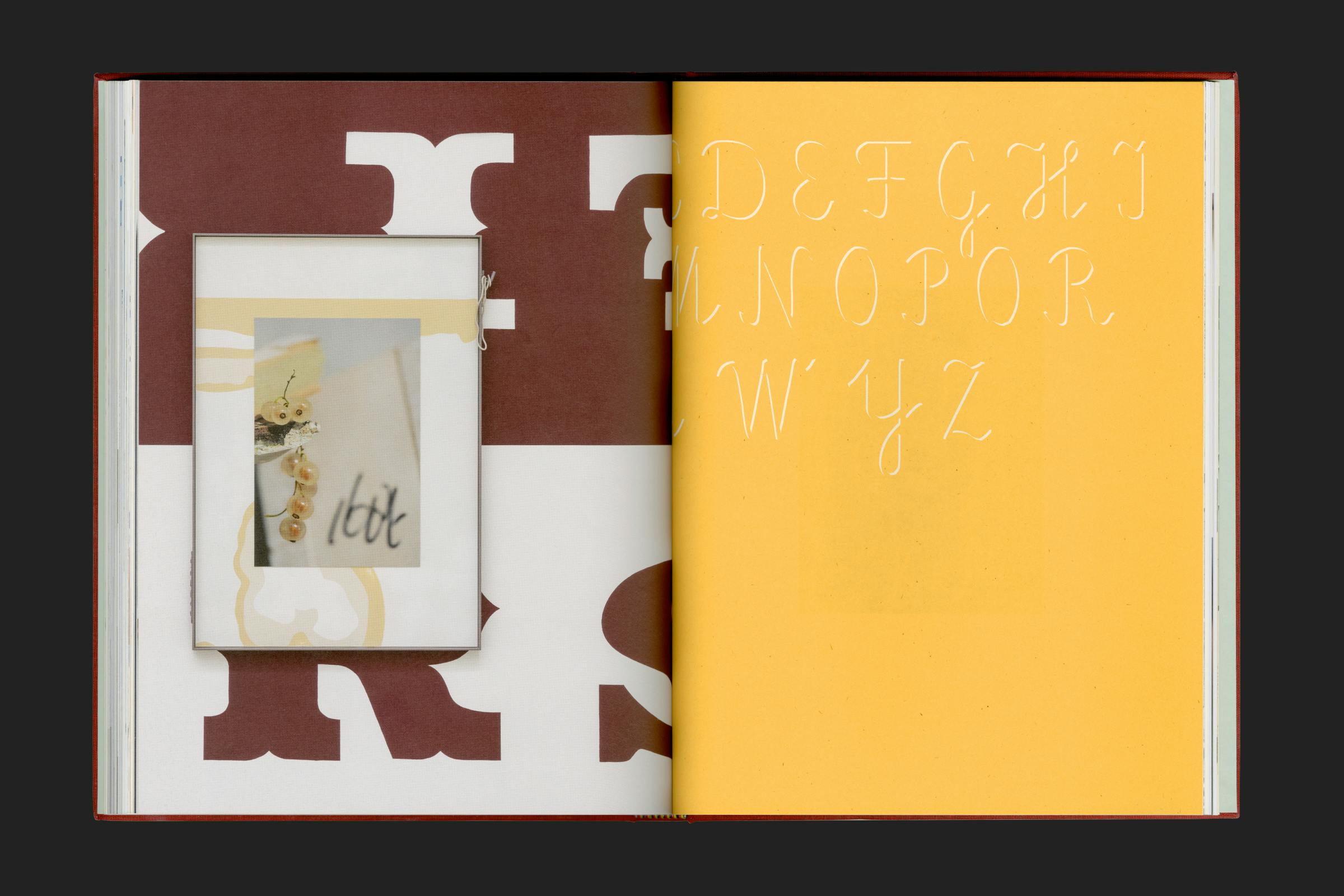
Cut-short pages of rough uncoated paper, printed in black and red Pantone, divide the book to separate the full bleed exhibition installation photography, and the other contextual content. The dividers show closely cropped details of the venue names, written out in the same letter styles as are used on some of the sculptures. These cropped letterforms have then been inlaid with textural details take from contextual photography taken from Reus’ initial research for the work.
Text is set in three disparate typographic styles: body text is set in Herbik, a contemporary take on classical Dutch Baroque styling; titling is in Windsor, a 1905 wood-block display serif with rounded corners and decorative letterforms that is often used as a go-to styling for packaging or flower shop signage; and contextual elements and captioning is in Maxima, a 1960s East-German take on the ‘International’ style with an aim for machine-like neutrality – which has been used in a variety of weights and widths throughout, complete with stylistically alternating lightweight punctuation, to draw further detail to the bolder titles.
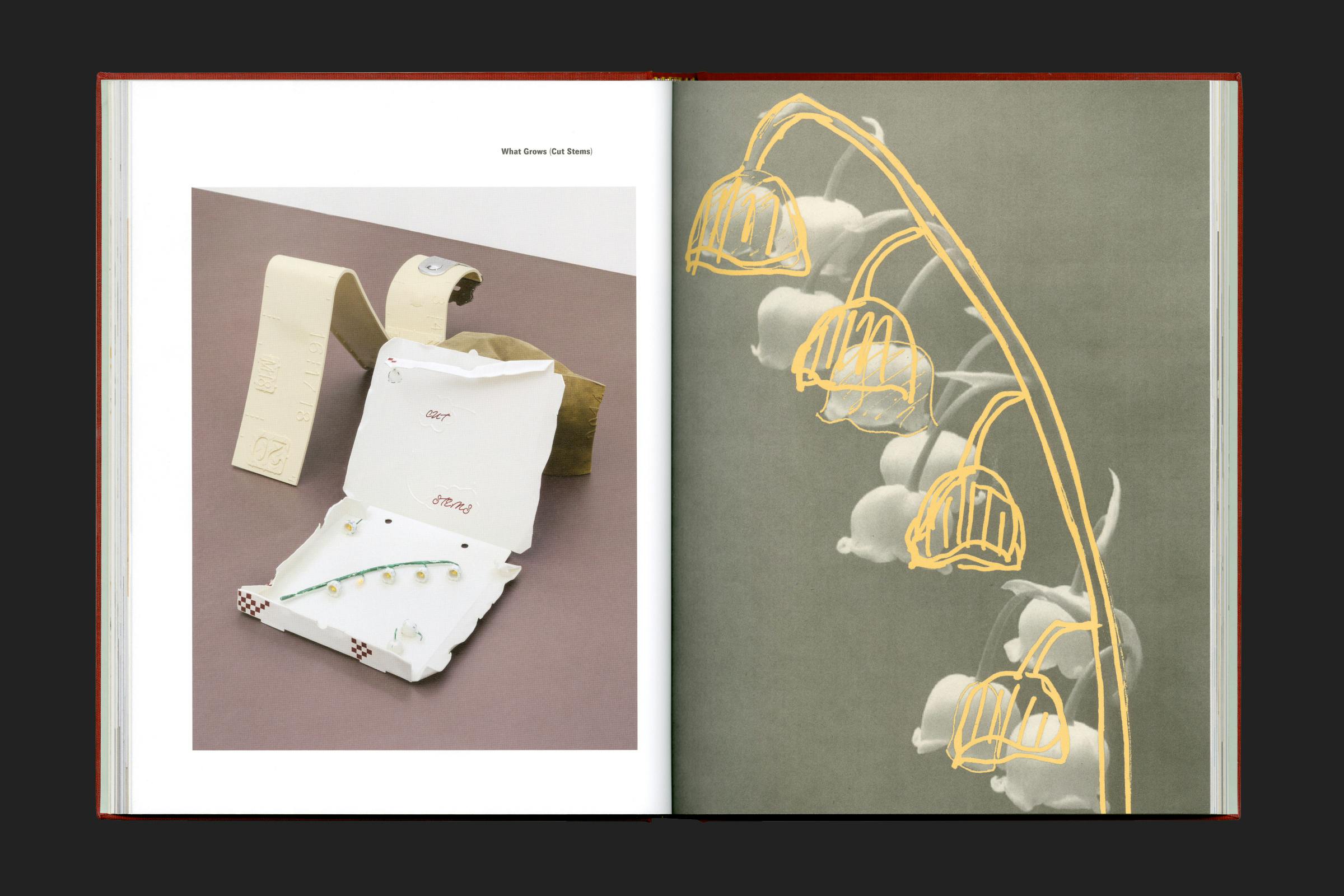
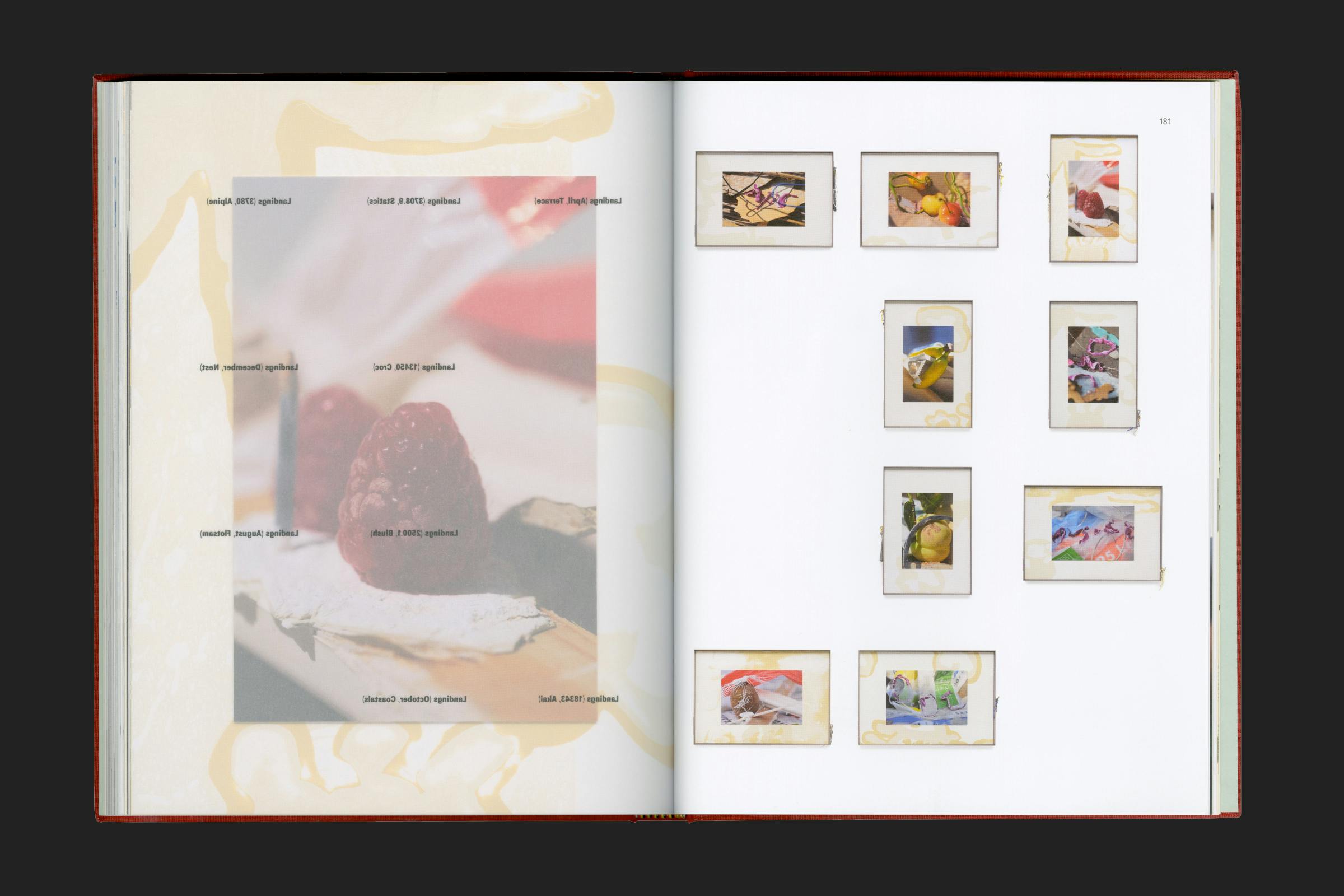
Transparent pages overlay captioning on top of the long-running ‘Landings’ series of framed works. Presenting a grid structure of imagery that is disrupted by full-bleed details of the photographic collages.