Wildlife Photographer of the Year
A complete redesign of the celebrated Wildlife Photographer of the Year exhibition, organised by the Natural History Museum and currently in its 58th iteration. This ongoing competition has a lead show in South Kensington, with an extensive touring programme that travels to over 20 destinations globally.
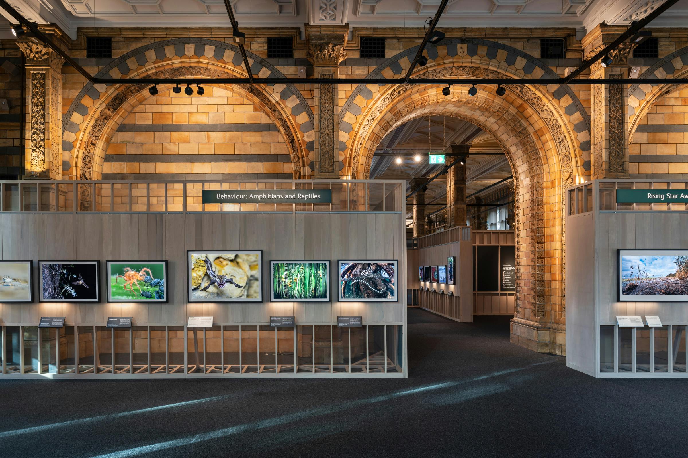
Working together with architects, Witherford Watson Mann, and a lighting team consisting of TM Lighting, Light Theory Studio and Fine Art Lighting, we have created an exhibition assembly with an environment focus at its core – an important factor when the subject matter often shows such difficult depictions of the destruction of natural habitats.
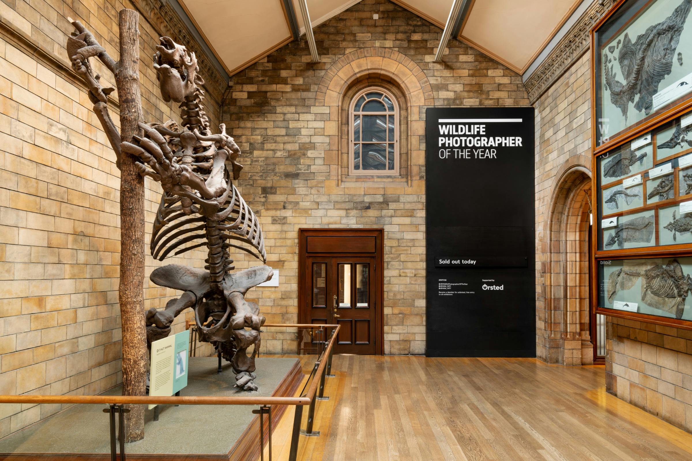
This consists of a modular framework that can be adapted, shuffled and re-used for years to come, and that also celebrates the elaborate Victorian architecture of the exhibition hall where the main show is situated, bringing to life the impressive masonry work within the space.*
Client
Natural History Museum
Category
Architecture
Witherford Watson Mann
Lighting
TM Lighting, Light Theory Studio, Fine Art Lighting
Photography
Ed Park
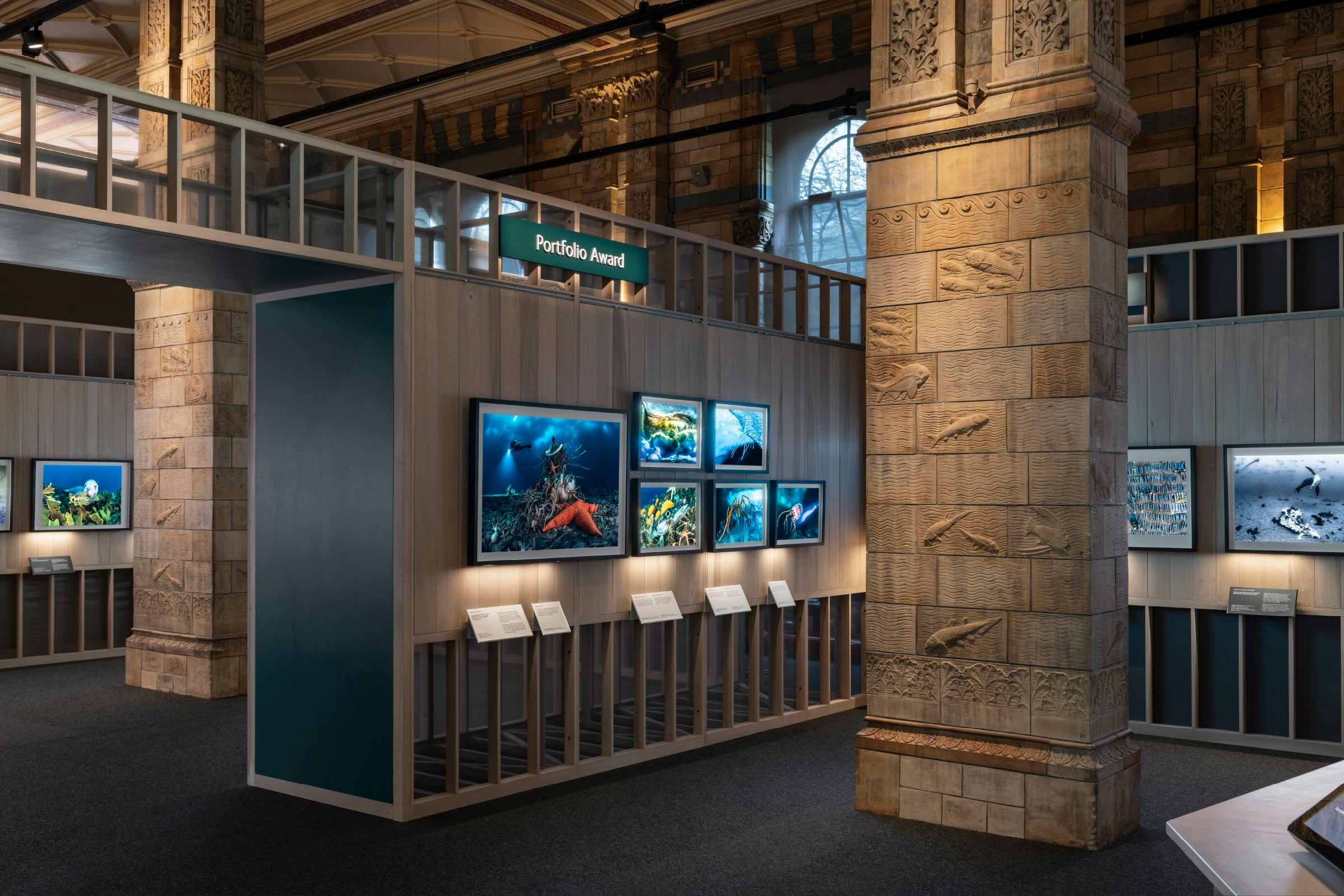
The exhibition framework is a skeletal structure built from sustainably sourced timber, that reveals the decorative carvings of the exhibition hall and integrates them into the design. These depictions of natural life are often concealed, but to us this was an integral part of the exhibition itself.
The warm colours of the wood, the wide open spaces, and the controlled inclusion of natural light that plays on the terracotta tiling creates an environment that encourages exploration.
The competition consists of numerous categories of imagery that are tied together thematically through either areas of the natural world or age group. Each work is presented on a back-lit screen to give vibrancy to the image, allowing specific areas of the artwork to be picked out in illumination to bring them to life.
The graphic elements of the show have each been created with sustainability and longevity in mind.
Artwork labels consist of a powder-coated metal framework that can be re-used for numerous years. Charcoal indicates a section winner and white ‘highly commended’.
This frame holds a caption that is printed on a pioneering paper stock that is created from 95% of waste from disposable cups. The remaining 5% in the recycling process is plastic, which is then used for energy recovery in the manufacturing of the paper.
Thematic sections and texts are highlighted through bold headline boards placed within and on top of the exhibition structure. These are created using a durable and hardwearing material that is manufactured out of waste FSC-certified recycled paper material, compressed together with a thermosetting resin.
Cut letters are then laid on top to indicate titles, constructed from a material the is manufactured out of waist from the textile industry. This combination of slightly varying whites gives a softer feeling to the physicality of the letters.
Text is printed on top of the boards using a direct-to-media printer, which can then be sanded back each year to allow the panel to be used again.
* In 1864 Francis Fowke, the architect who designed the Royal Albert Hall and parts of the Victoria and Albert Museum, won a competition to design the Natural History Museum. When he unexpectedly died a year later, the relatively unknown Alfred Waterhouse took over and came up with a new plan for the South Kensington site.
Waterhouse used terracotta for the entire building as this material was more resistant to Victorian London's harsh climate. The result is one of Britain’s most striking examples of Romanesque architecture, which is considered a work of art in its own right and has become one of London's most iconic landmarks. A cathedral for the natural world.

