The Cult of Beauty
In every culture and era, an ideal of beauty arises as a universal value, worthy of going to great lengths to attain and sustain. What are the driving forces that have led us to believe in a myth of universal beauty, despite its evolving nature?
‘The Cult of Beauty’ is a major exhibition exploring notions of beauty across time and cultures, exploring three overarching themes: The Ideals of Beauty, The Industry of Beauty and Subverting Beauty. Examining the profound influence of morality, status and health, age, race and gender on the evolution of ideas about beauty through history.
Client
Wellcome Collection
Category
Exhibition
26 October 2023 – 28 April 2024
Curator
Janice Li
Assistant Curators
Adam Rose, Sophie Schneider
Architecture
Pup Architects
Photography
Thomas Adank
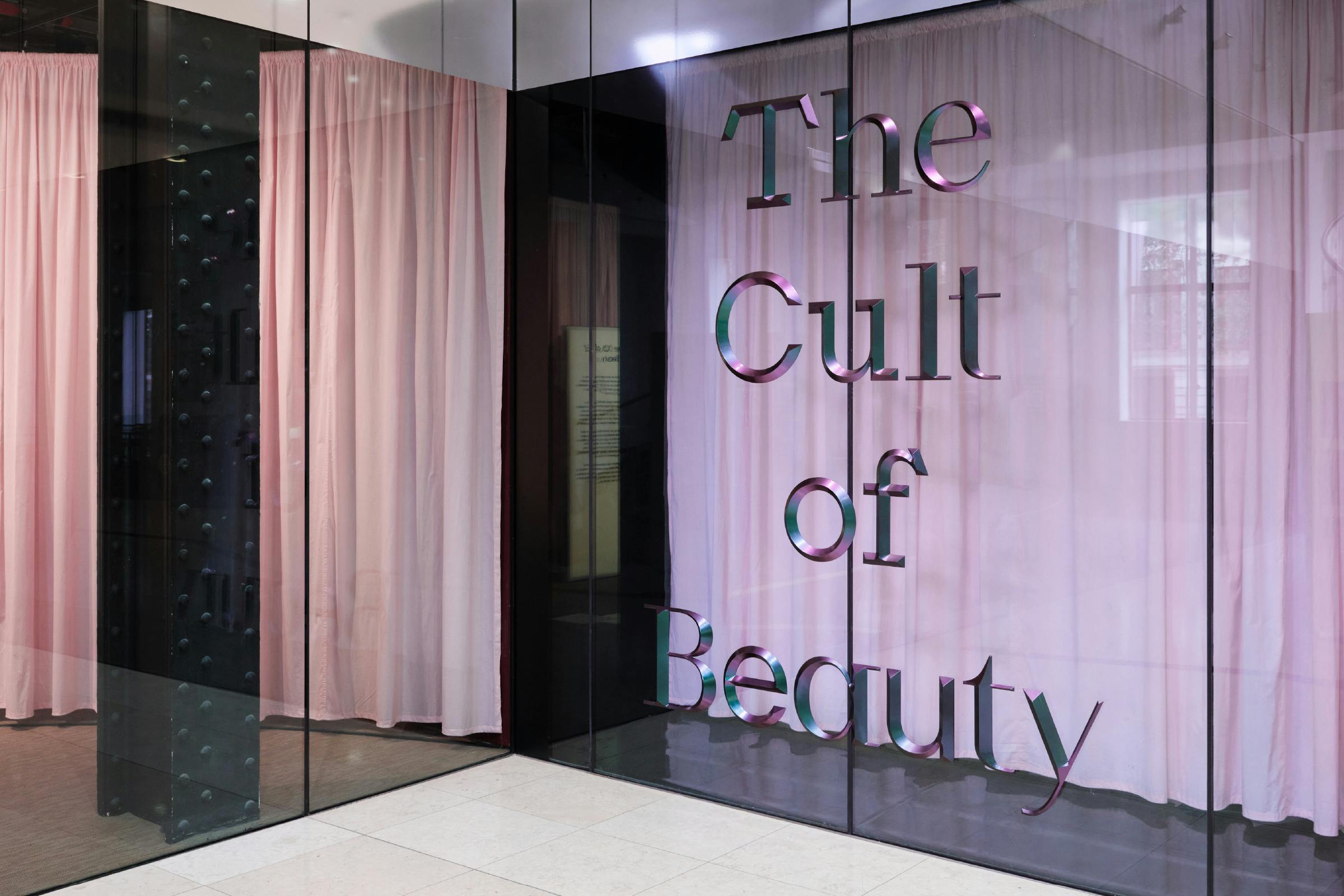
The main title in the entrance lobby utilises three dimensional prismatic lettering, finished with iridescent flip paint that shimmers and glitters from red to purple to blue to green as you enter the exhibition. Creating a photographable moment of drama and intimacy when juxtaposed against the pale pink closed curtains hanging behind the darkened glass.
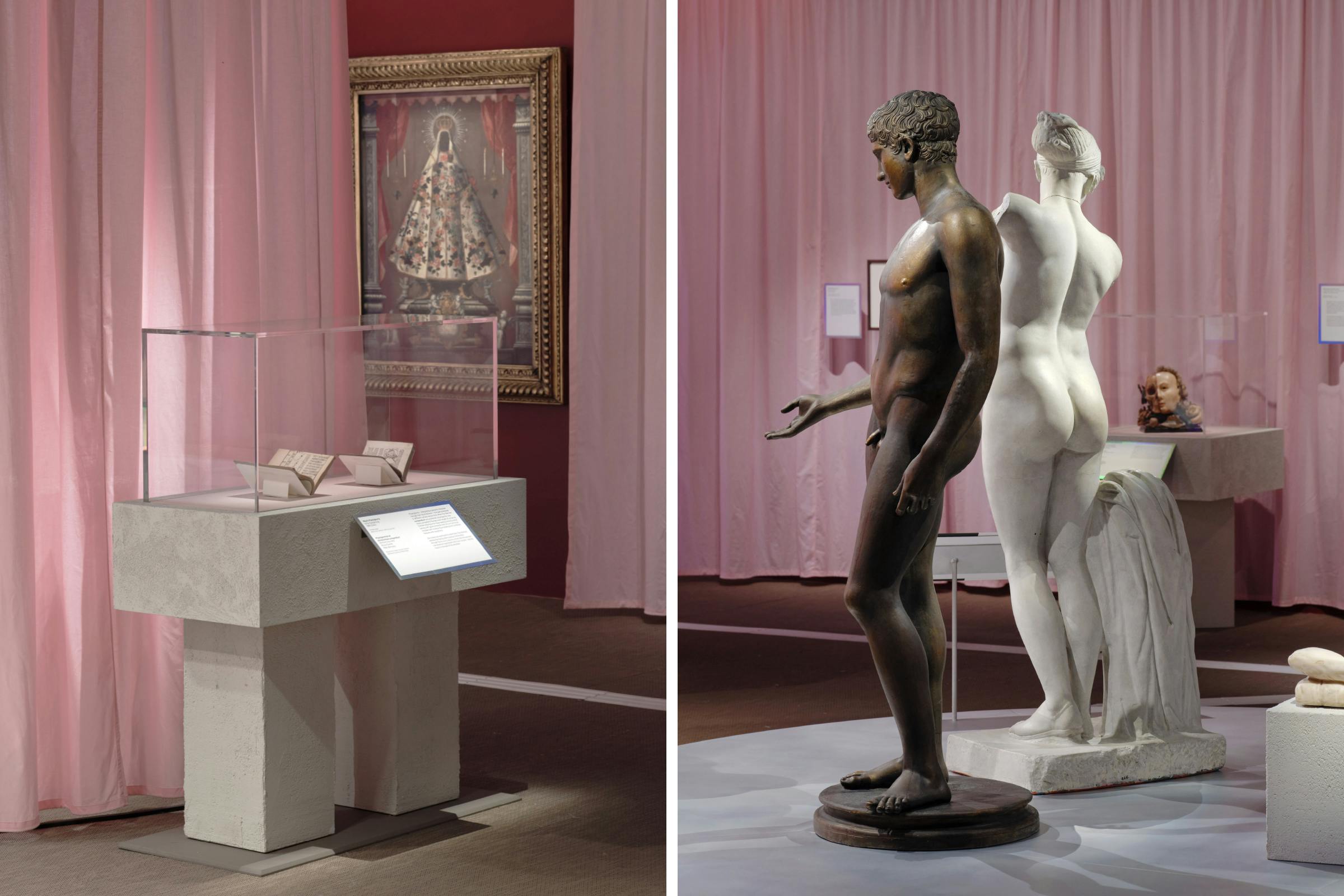
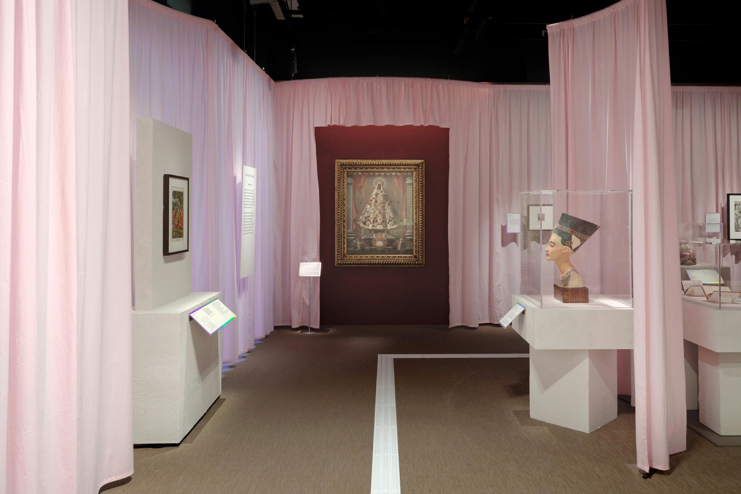
The use of curtains creates tantalising moments within the exhibition, shaping the gallery and allowing obscured views through to divided spaces.
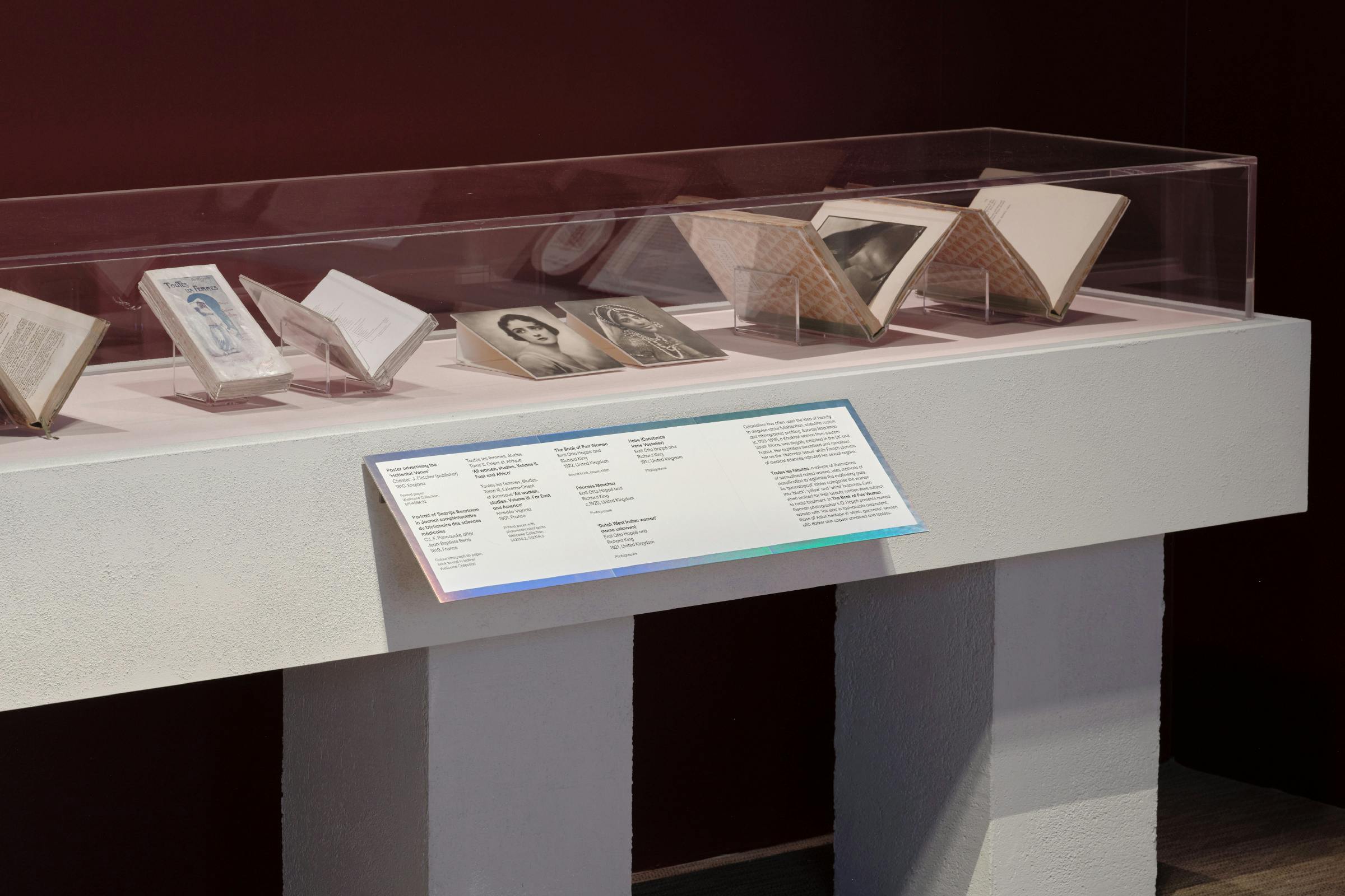
The exhibition production plays on the ever changing nature of ‘beauty’, using material that catches the light and shifts colour as you walk through the space. From holographic foil caption edges to gradient printed fabric hangings, to high gloss wall quotes.
The captions are built up from modular boards that can be recycled after the exhibition closes. A rainbow foil indicates the museum voice, and a red–purple foil denotes a contextual text from a guest writer.
Section texts are displayed on totemic light box screens, and sub section texts are printed on a hung board material that is created from recycled fabric. Giving the two elements a contrasting material texture.
The exhibition voice evolves throughout the show, using a bespoke, variable typeface design created in collaboration with Seb McLauchlan. This shifts from a skeletal neutral sans serif through to three other different typographic styles – a slab serif, a ‘traditional’ serif and a high-contrast sans serif – one for each thematic section.
The changing typography represents the multifaceted voice of the beauty industry, fluctuating and changing with trends. These typographic styles blend together for the main title of the exhibition to show that aesthetic ideals are often interchangeable. Embracing the ugly and the beautiful – and the fine line in between.
Type Design
Seb McLauchlan
A corresponding gallery guide leads you through the exhibition, along with a concertina guide to the ‘Beauty Sensorium’ – a specially commissioned interactive installation by Renaissance Goo × Baum & Leahy, bringing together historical beauty references with reconstructions of Renaissance make-up recipes.
This print decodes the various aspects of the installation. It is printed on a paper created from an innovative process that repurposes overabundant algae. Taking inspiration from the organic matter found within the vials.


