Magali Reus: Kool
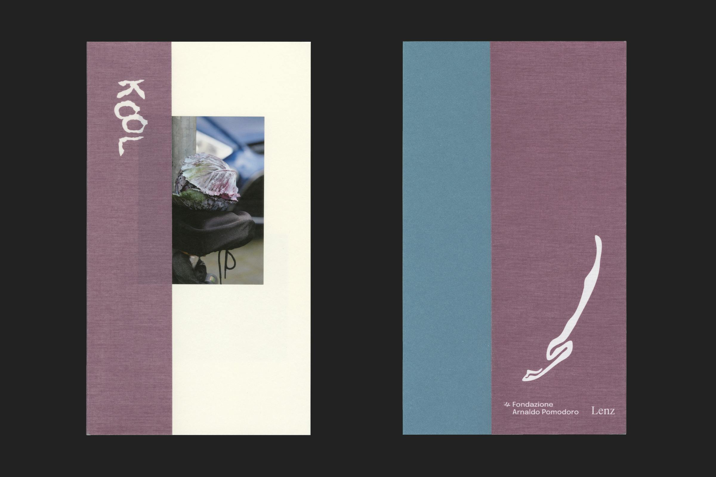
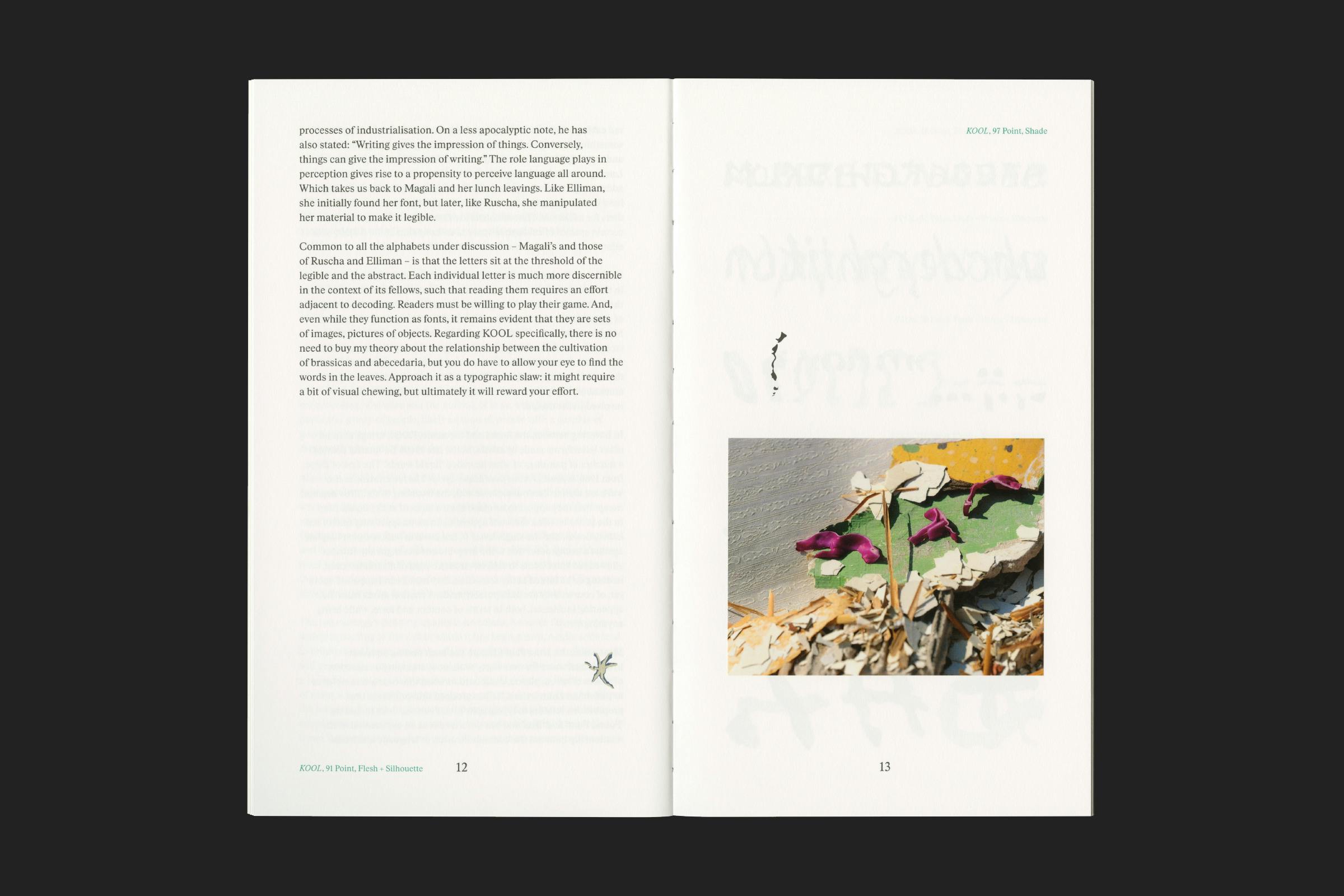
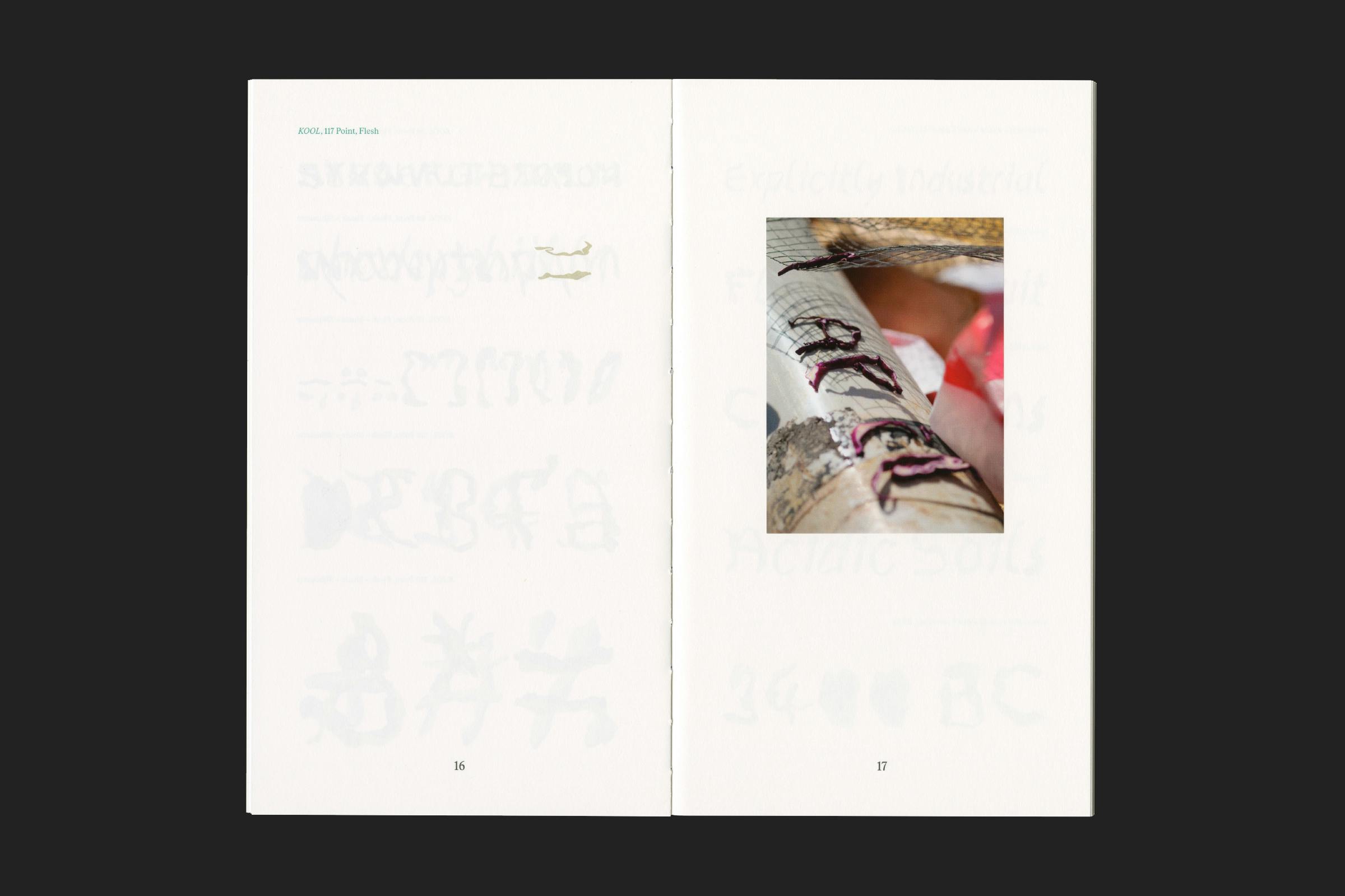
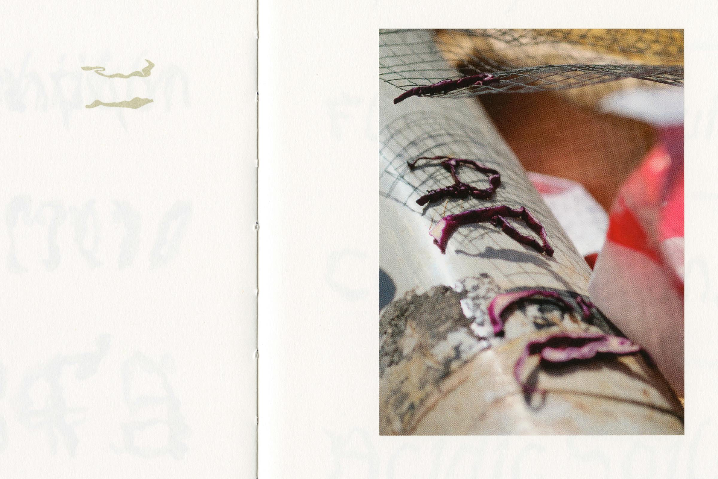
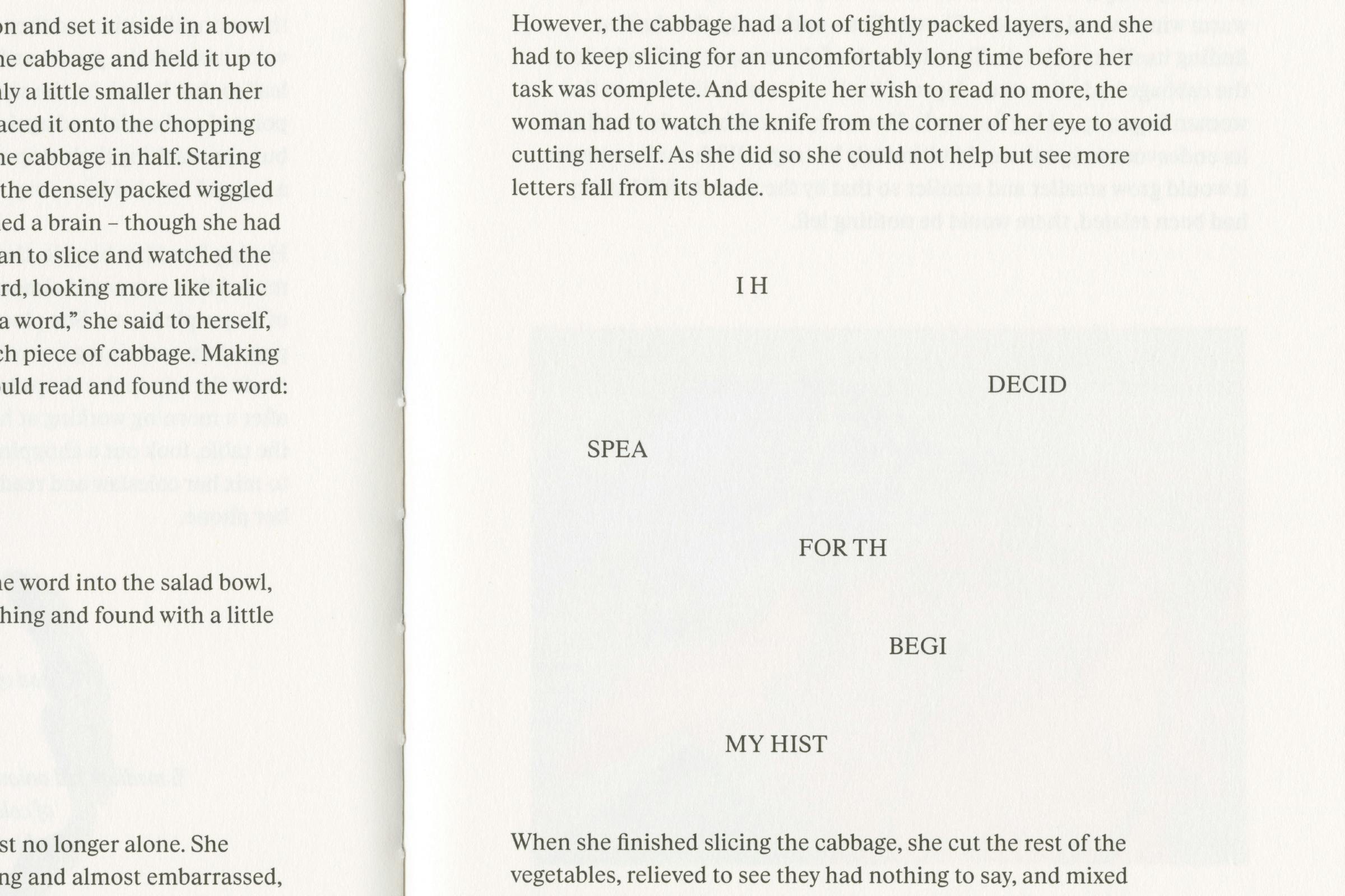
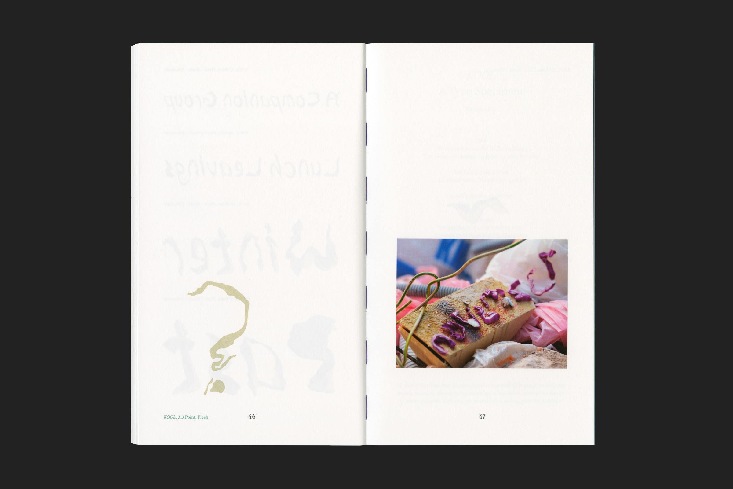
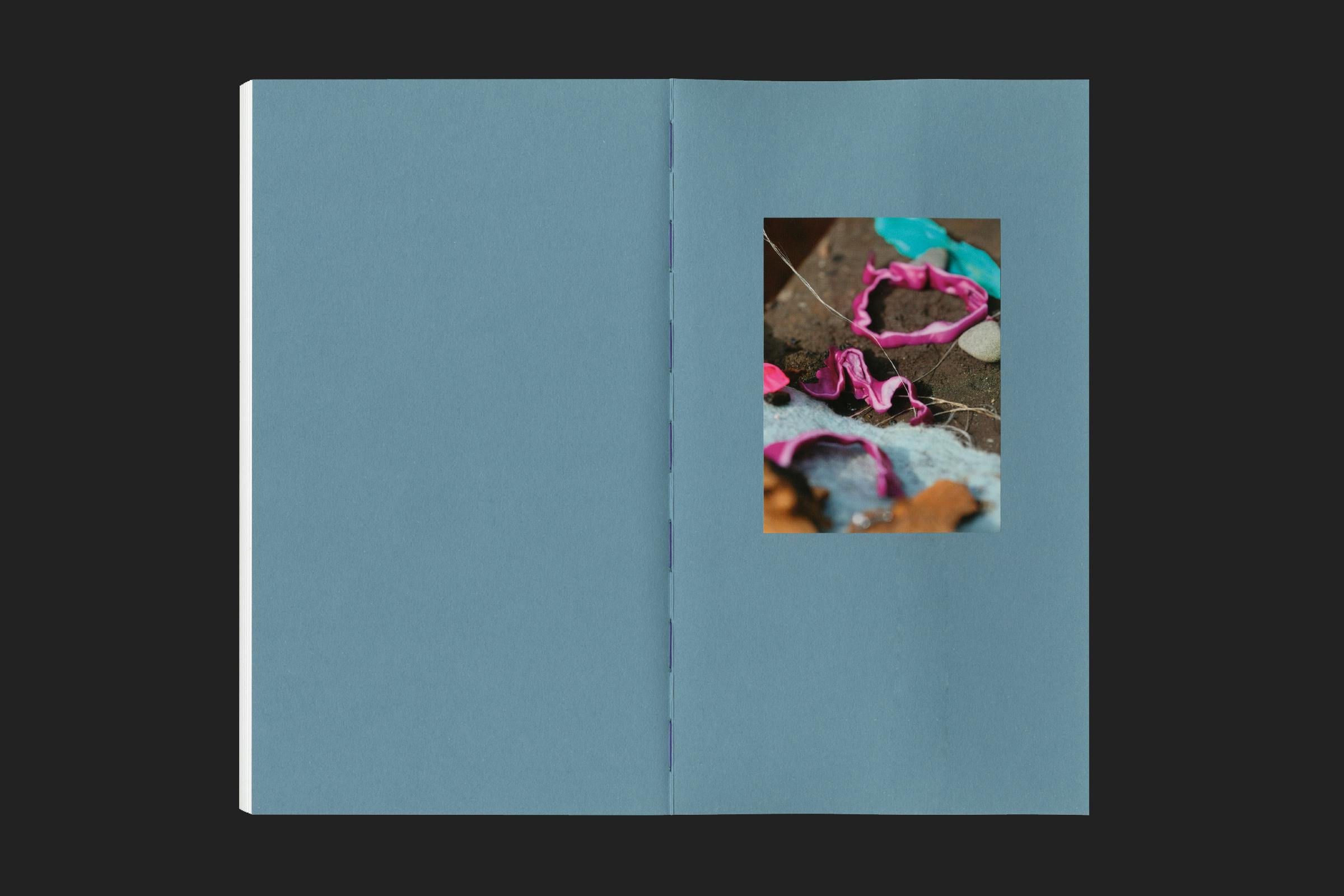
An artist’s book which collects and presents the results of a three-year research project by Magali Reus on the visual and calligraphic relationship between letterforms and scraps of red cabbage.
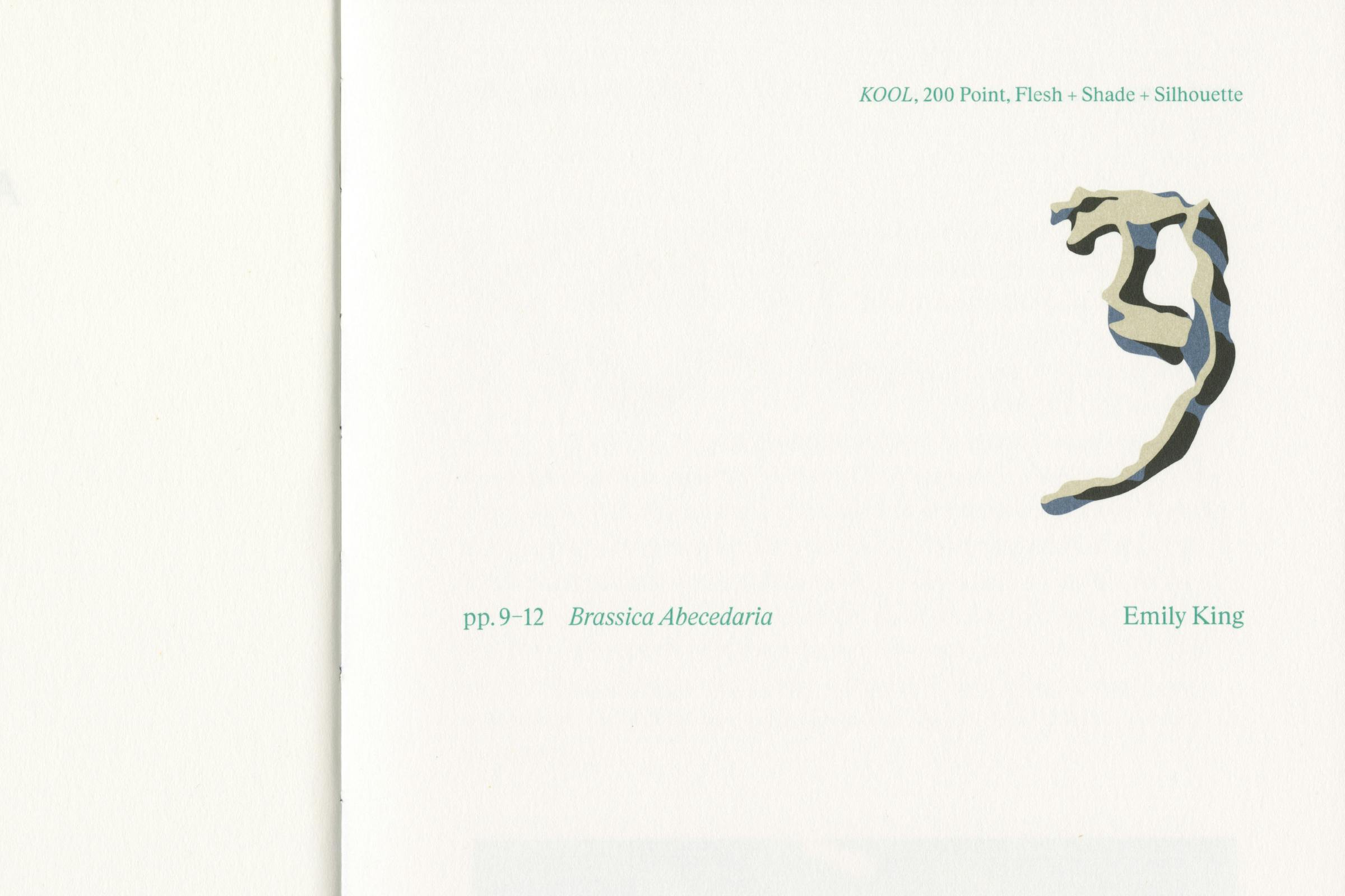
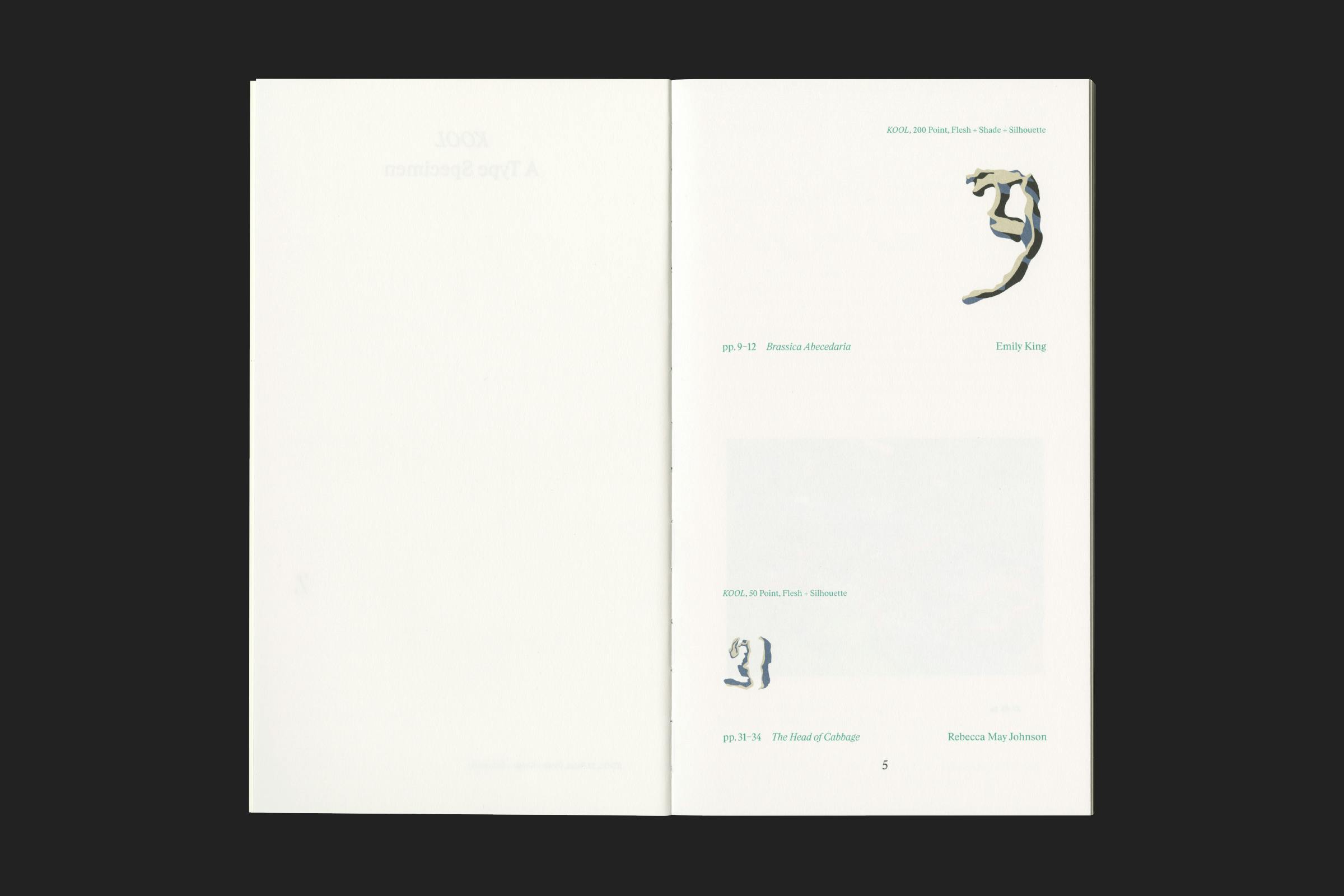
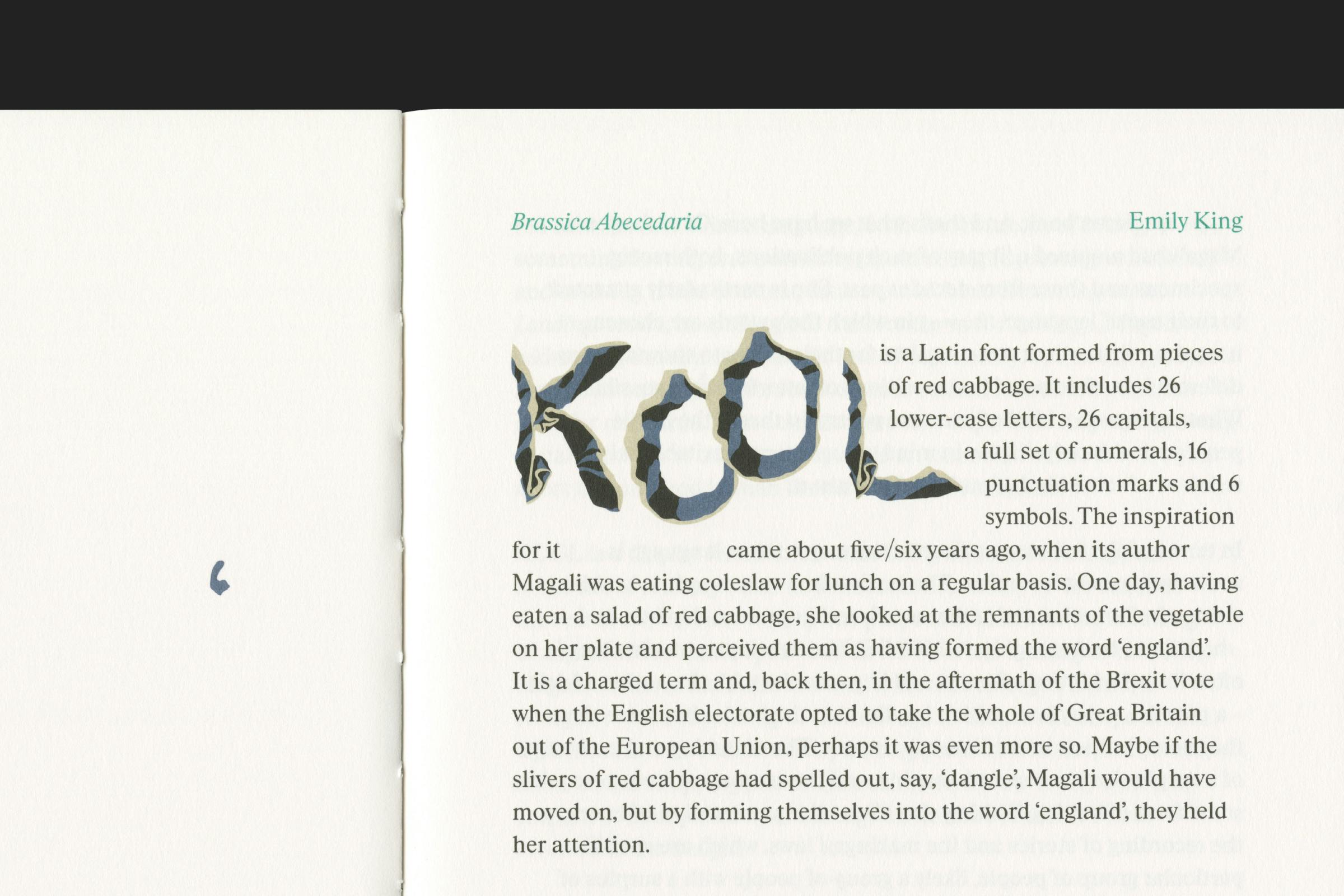
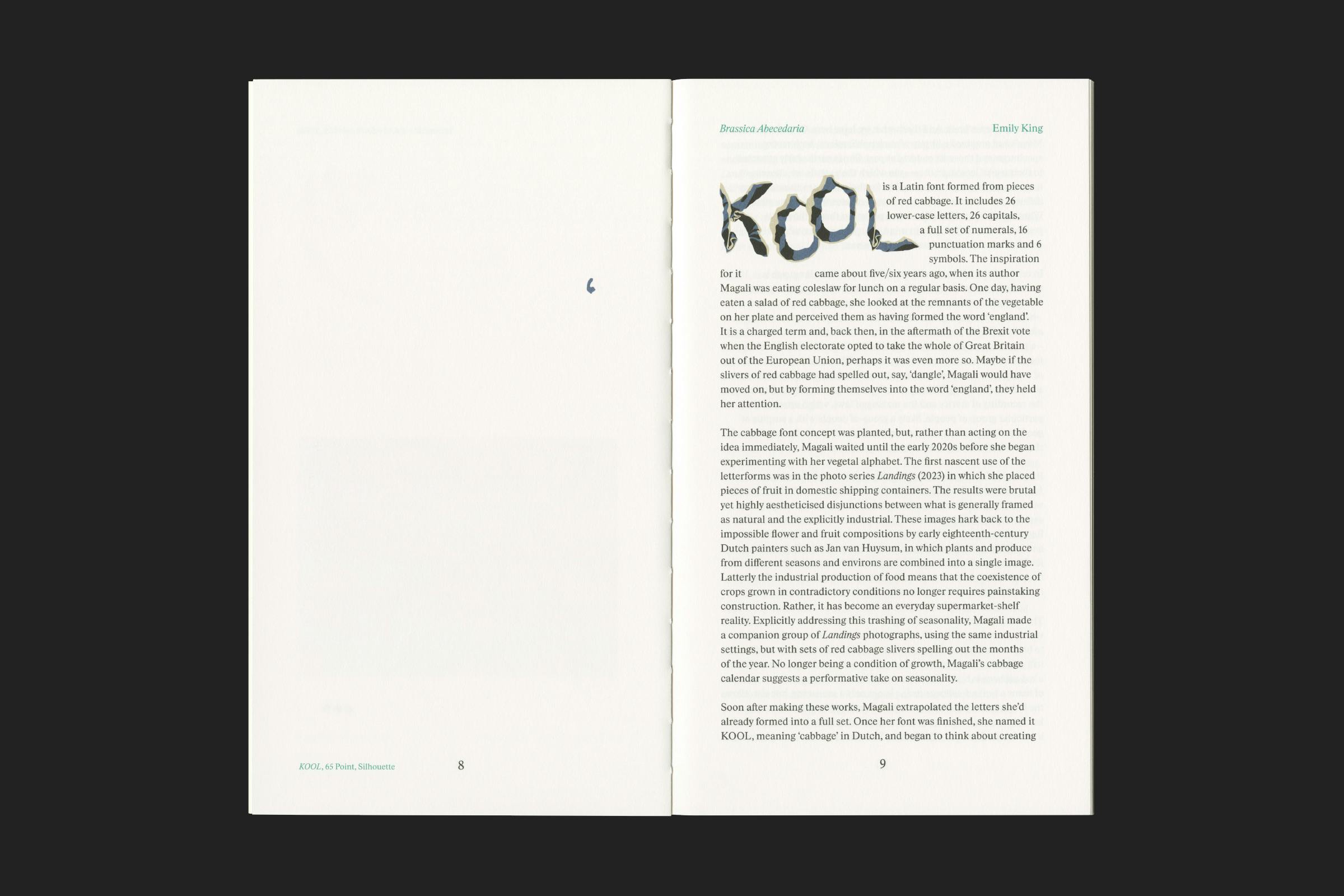
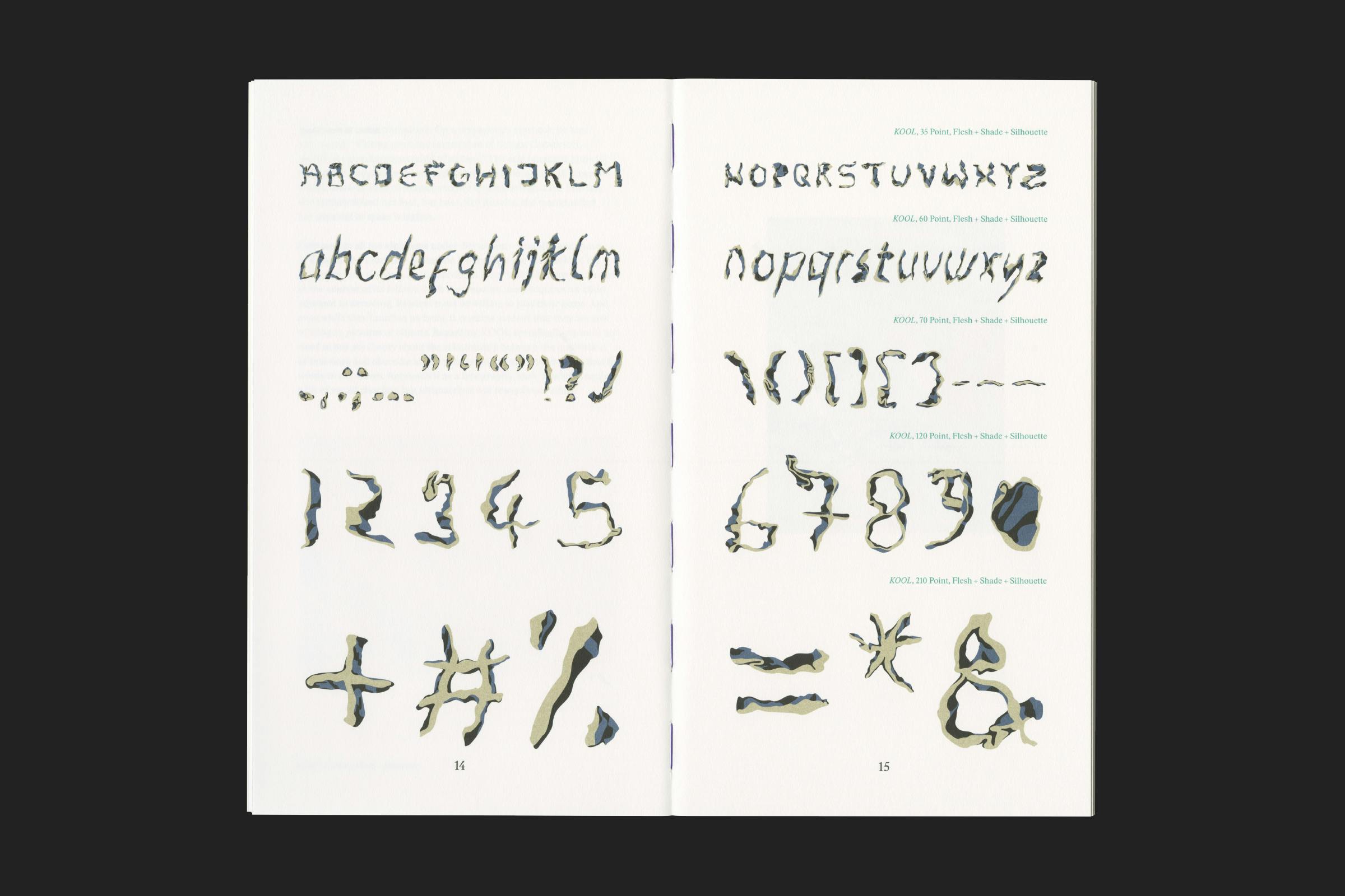
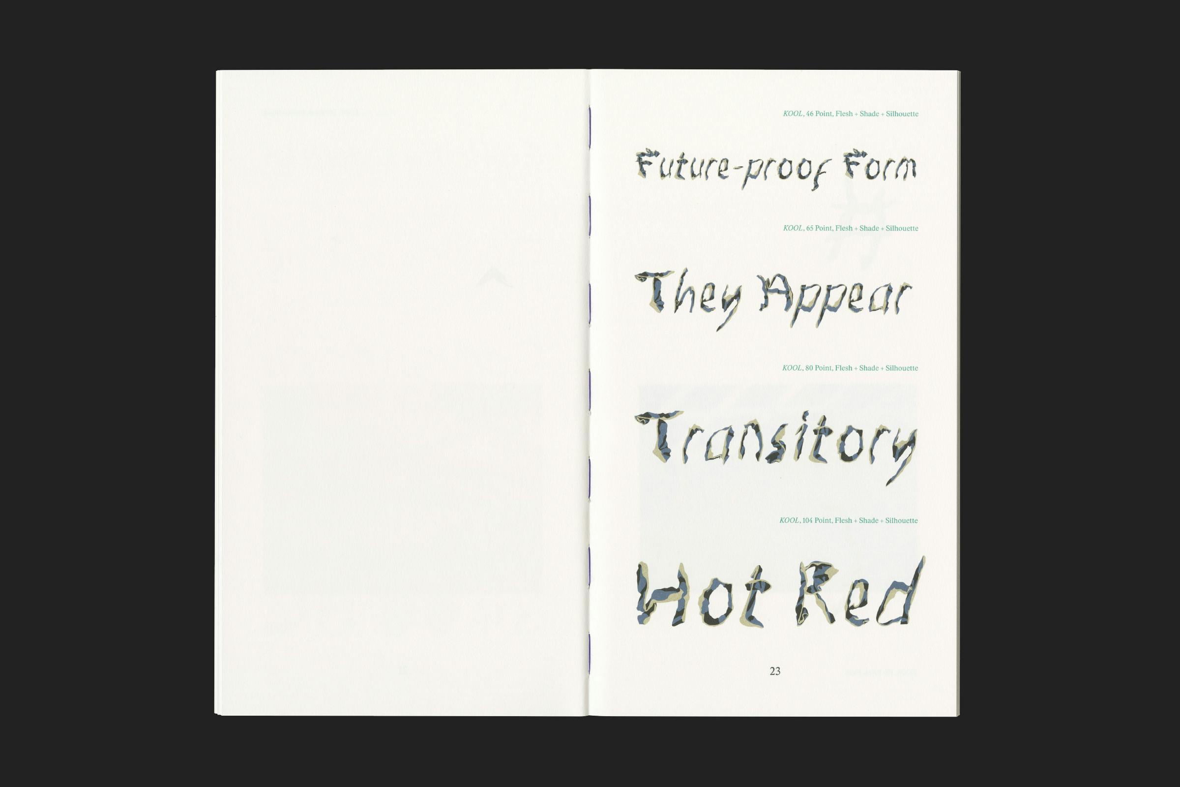
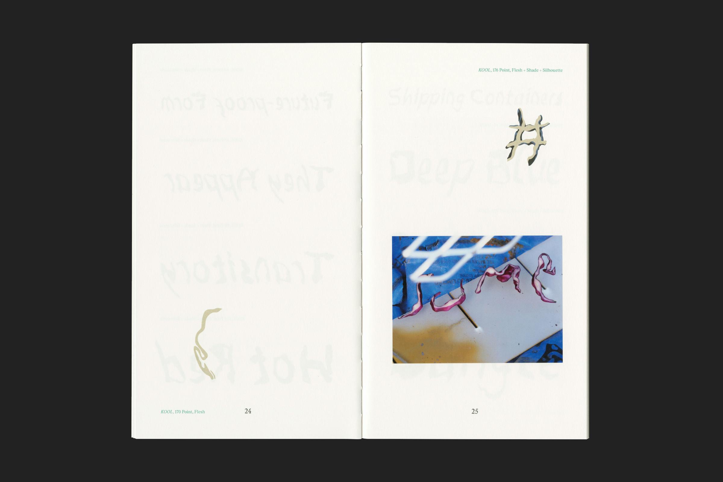
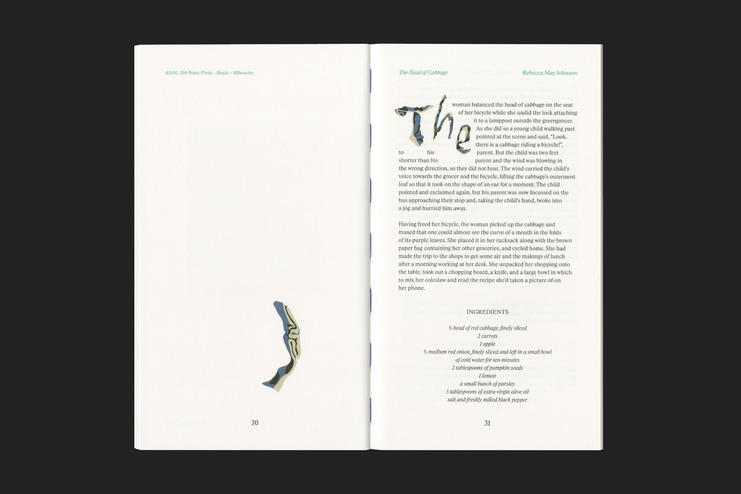
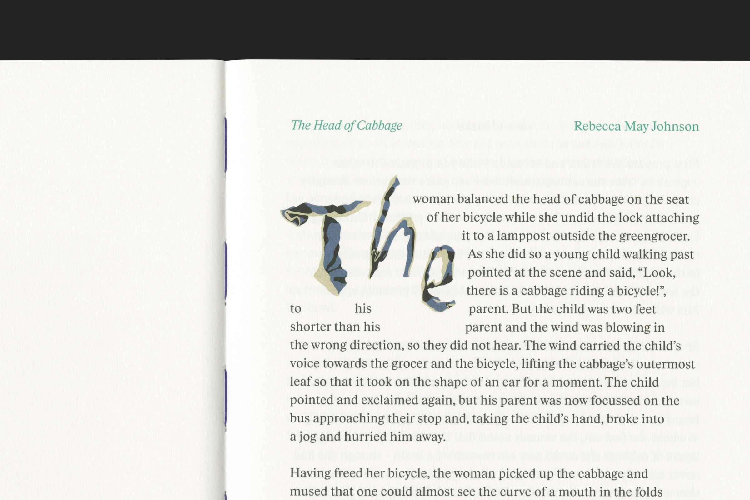
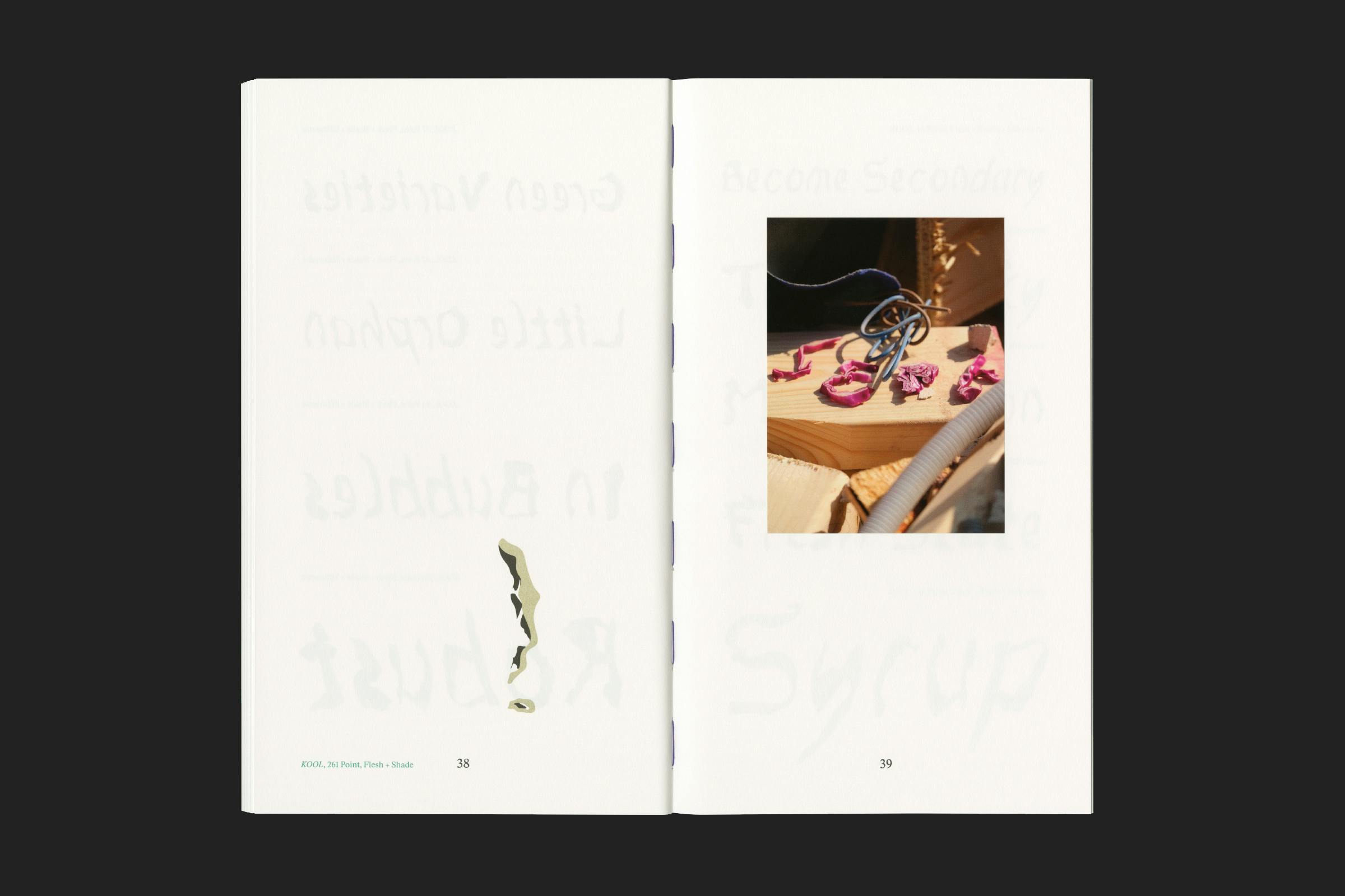
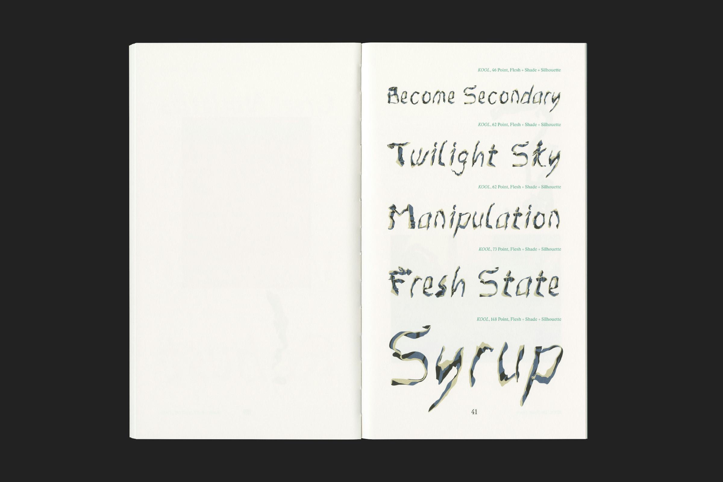
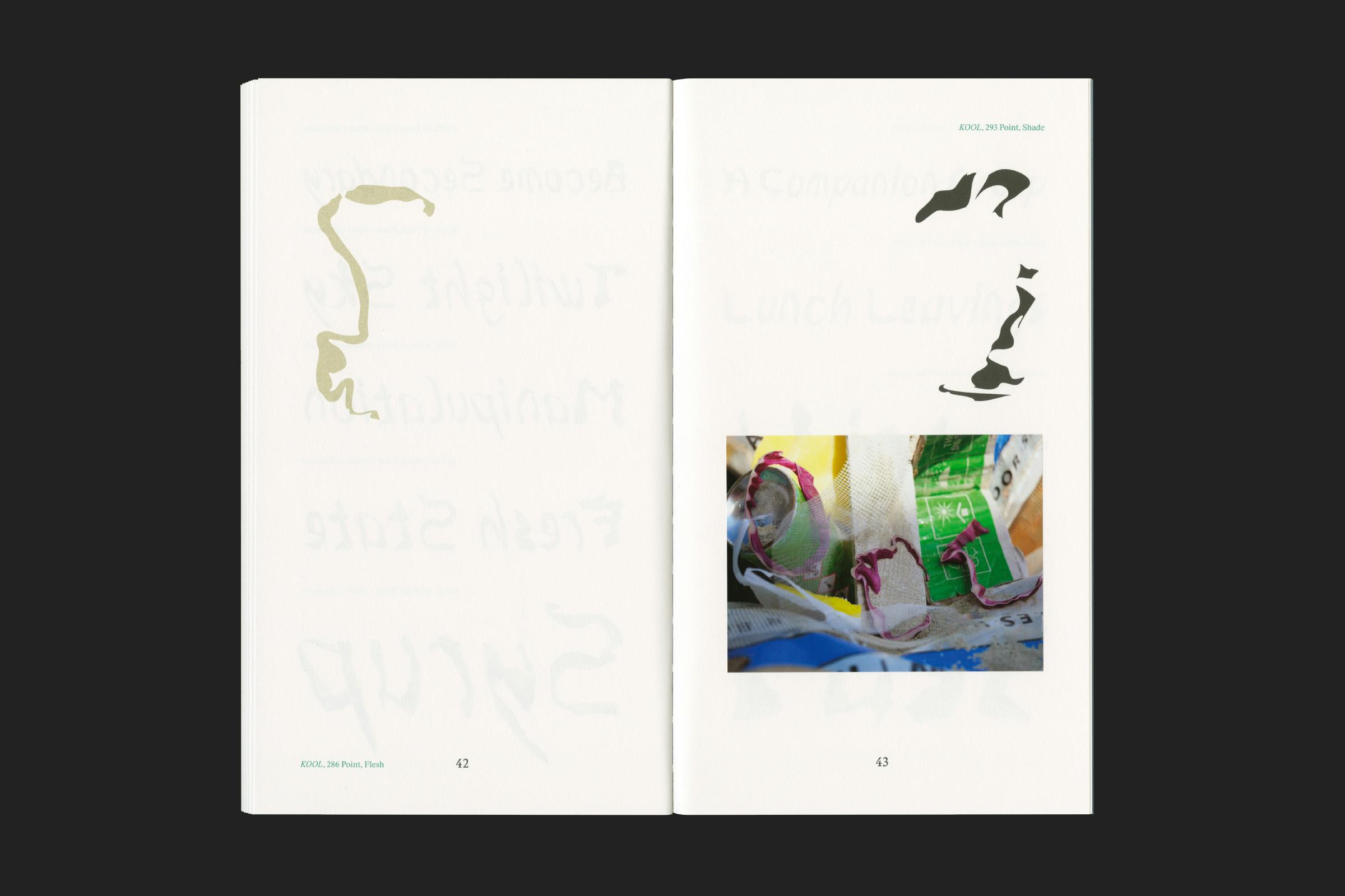
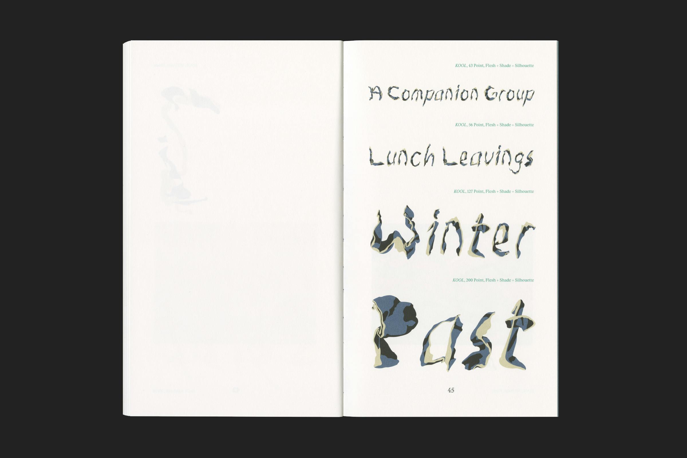
The typeface ‘KOOL’ (‘cabbage’ in Dutch) is a working typeface containing a Latin alphabet of upper and lowercase letters, a full set of numerals, 16 punctuation marks and 6 additional symbols, split between 3 combinable layers – Flesh, Shade and Silhouette – each abstractedly exploded throughout the layout.
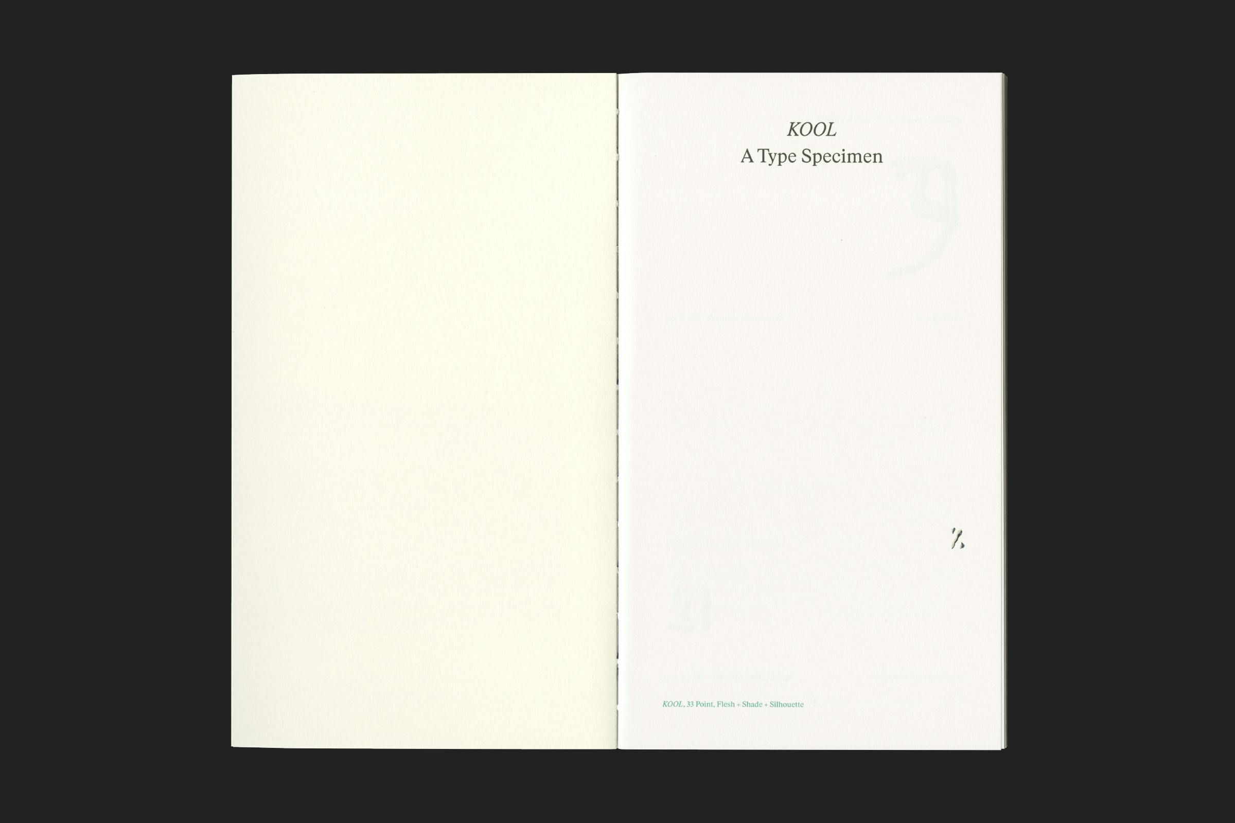
The publication itself takes cues from traditional type specimens, with waterfalls of comparative words, and features an essay on display typography by design historian, Emily King, plus a story and recipes by food specialist, Rebecca May Johnson.
Client
Lenz Press
Category
Co-Publisher
Fondazione Arnaldo Pomodoro
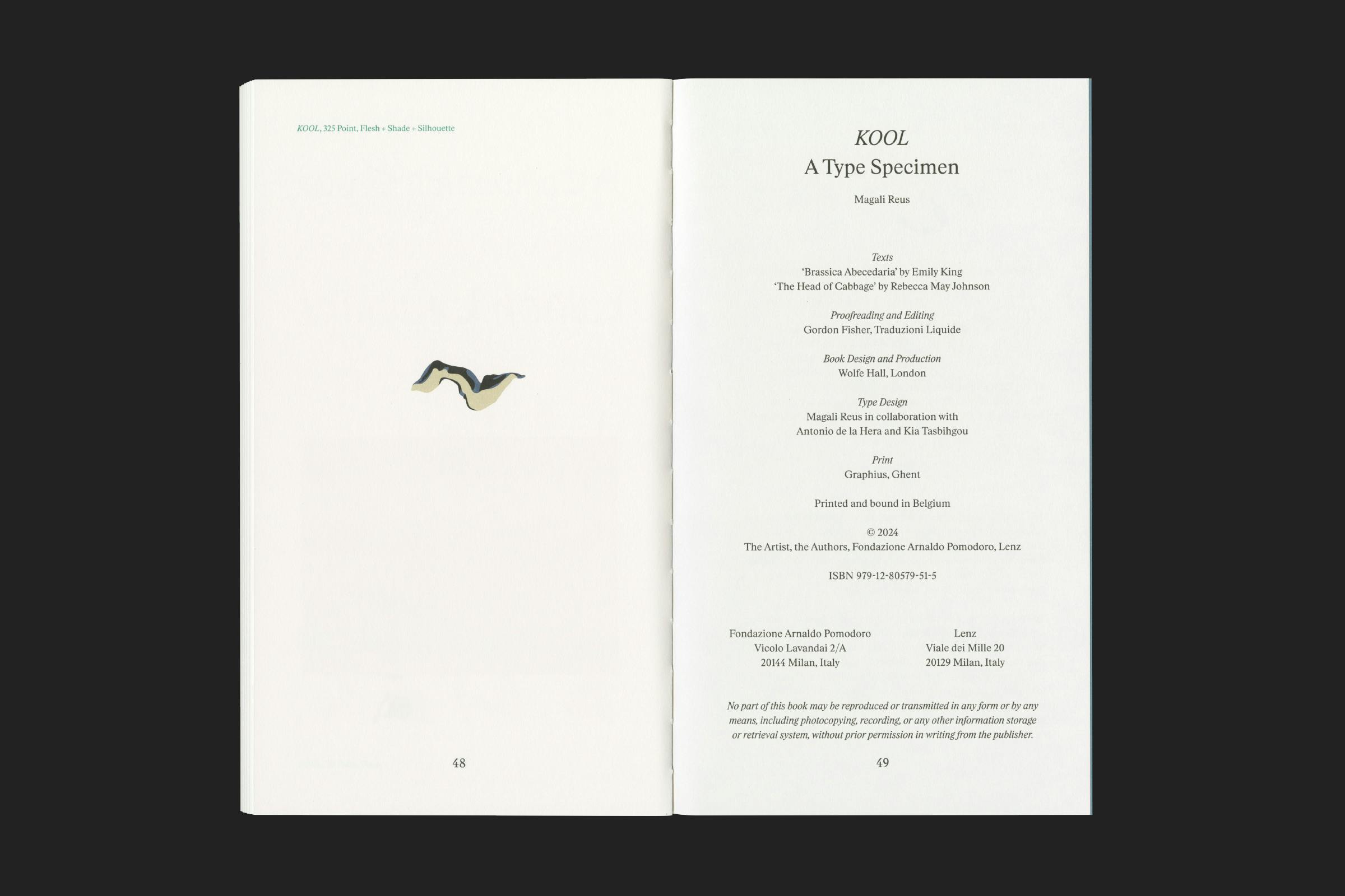
Texts
Emily King, Rebecca May Johnson
Management
Antonio de la Hera
Type Engineering
Kia Tasbihgou
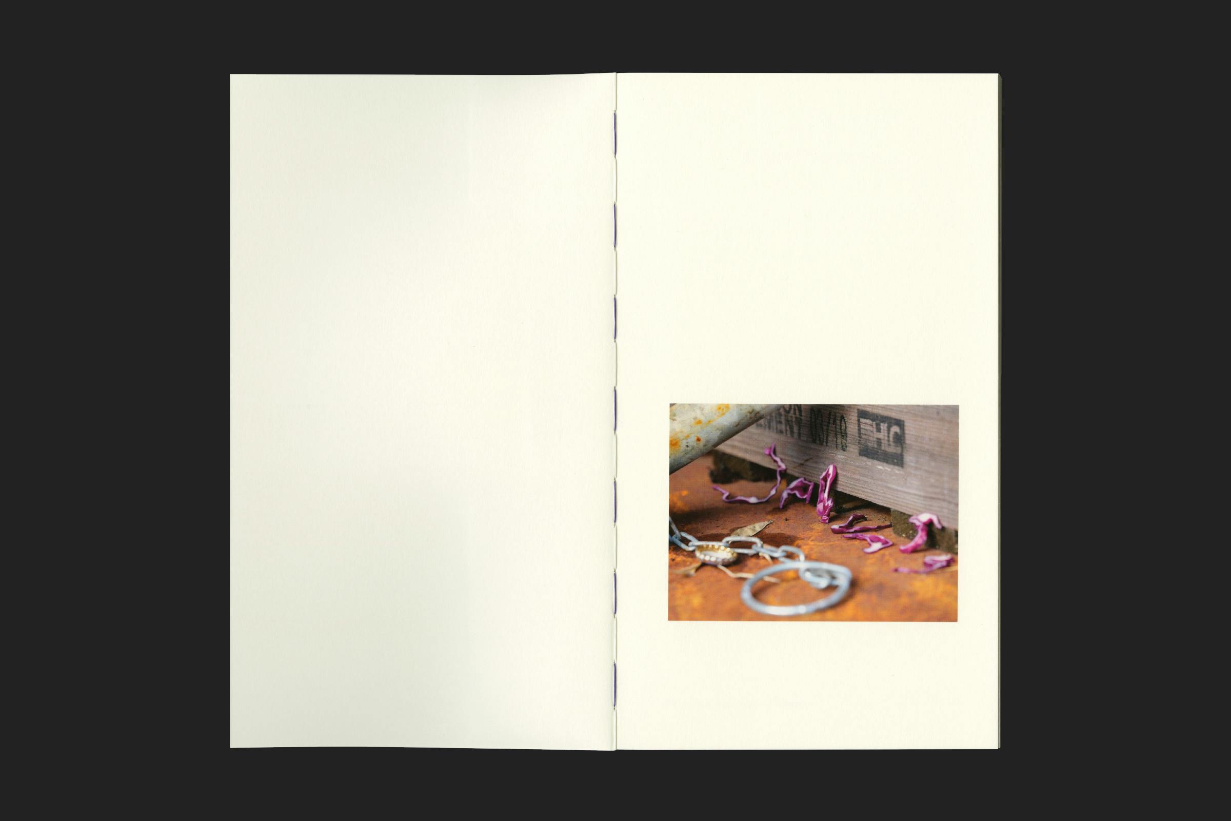
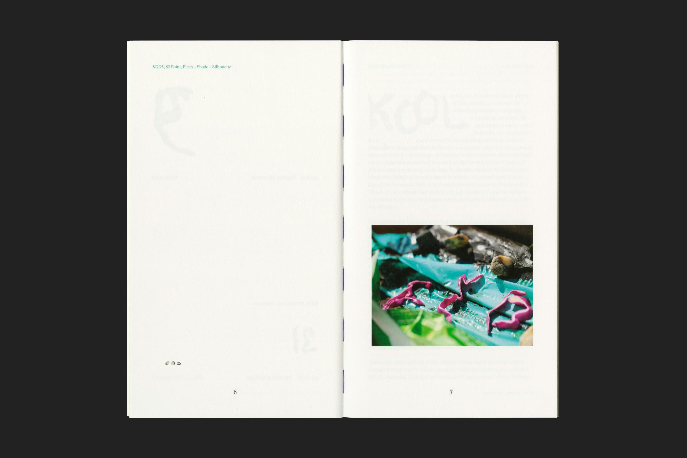
The book is printed in black and three Pantone colours onto a range of warm white and coloured stocks, featuring tipped in gloss photographs of Reus’ cabbage compositions that punctuate the layout.
A cabbage-purple thread ties it all together, covered with a fabric strip over the spine.
The print is then encased within a green ‘napkin’ style jacket, created from a textile-embossed paper that is intricately hand folded to create a table-setting inspired pocket.
Format
160 × 280 mm
Extent
84pp
Cover
Softback, cloth over spine
Binding
Exposed stitch
Typefaces
Kool, Rhymes
This edition was created in conjunction with ‘Off Script’: a solo exhibition by Reus, staged by the Arnaldo Pomodoro Foundation in collaboration with the Museo del Novecento, both in Milan.
